
Website Usability Testers: A Practical Team Guide
TL;DR:
- Effective usability testing can reveal most user problems with just 3 to 5 participants per segment, saving time and costs. Integrating accessibility into standard sessions improves results for all users and accelerates actionable insights. Using focused, scenario-based tasks in iterative cycles enables teams to continually refine user experiences efficiently.
Most digital product teams assume effective usability testing requires dozens of participants, expensive lab setups, and months of planning. That assumption keeps only 55% of companies running any usability testing at all, even though the evidence consistently shows small, focused sessions outperform sprawling studies. The truth is that skilled website usability testers working with the right methods can surface the most critical problems in a fraction of the time. This guide gives usability researchers and product teams a direct, practical framework for recruiting, testing, and iterating their way to measurably better user experiences.
Table of Contents
- Key takeaways
- What website usability testers actually do
- Recruiting the right testers
- Moderated vs. unmoderated testing
- Integrating accessibility into usability sessions
- Running iterative testing cycles
- My honest take on usability testing programs
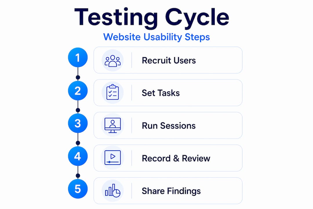
- Take your testing further with Gostellar
- FAQ
Key takeaways
| Point | Details |
|---|---|
| Small samples work | Testing with 3-5 participants per segment uncovers 80-85% of usability problems. |
| Segment your testers | Recruit distinct user groups separately to avoid diluted, misleading results. |
| Match method to goal | Use moderated testing to diagnose problems; use unmoderated testing to validate at scale. |
| Accessibility belongs inside usability | Integrating keyboard and screen reader tasks into standard sessions improves results for all users. |
| Iterate, don't batch | Multiple short test-fix-retest cycles surface more issues than a single large study. |
What website usability testers actually do
Website usability testing is the practice of observing real people attempt realistic tasks on a site and recording where they succeed, struggle, or quit. The goal is not to ask users what they like. It is to watch what they do.
Website usability testers are the participants at the center of this process. They are not quality assurance engineers checking for broken code, and they are not survey respondents sharing opinions. They are representative members of your actual or intended user base, recruited to complete tasks while researchers observe their behavior, decision-making, and points of confusion.
The core objectives of a web usability test are:
- Task success rate: Can users complete key actions without assistance?
- Time on task: How long does completion take, and where does time get wasted?
- Error frequency: How often do users choose wrong paths or recover from mistakes?
- Satisfaction: How do users feel about the experience after completing tasks?
- Discoverability: Can users find features, content, or navigation they have never seen before?
What separates usability testing of websites from other user research is behavioral specificity. A survey tells you that users find checkout confusing. A usability session shows you exactly which field triggers that confusion, what assumption caused it, and what the user tried to do instead. That level of detail drives design decisions that generic feedback never could. If your team relies only on analytics and surveys, you are seeing the what without the why, and that gap is where bad design decisions live.
Recruiting the right testers
Getting the participant strategy right matters more than most teams realize. The most common mistake is treating "users" as a single homogeneous group. If your site serves small business owners and enterprise procurement managers, those are two distinct user segments with fundamentally different mental models, workflows, and expectations. Testing those groups separately is the only way to detect problems that are specific to each.

How many participants do you actually need? The research is clear: 3-5 users per segment reveal approximately 80 to 85 percent of the usability problems present. Running 20 participants from a blended pool will likely surface fewer distinct issues because the signal gets averaged out across groups with very different behaviors.
Here is a practical recruiting sequence for most usability testing web projects:
- Define your user segments based on job role, experience level, or primary use case. Avoid the temptation to collapse two distinct groups into one to save time.
- Write a screener survey that filters for relevant characteristics: industry, frequency of use, device preference, and any domain knowledge requirements.
- Recruit from outside your organization. Colleagues and internal staff know the product too well. Their familiarity masks the exact navigation problems that real users hit.
- Offer appropriate incentives. Gift cards, cash, or charitable donations are standard. Match the incentive to the time commitment and expertise required.
- Schedule buffer sessions. Participants cancel. Build at least one backup slot per segment into your plan.
- Follow ethical guidelines. Obtain informed consent, explain how recordings will be used, and allow participants to withdraw at any point without penalty.
Pro Tip: For unmoderated remote sessions, over-recruit by 20 to 30 percent. Drop-off rates of 15 to 25 percent are normal in unmoderated testing, and arriving at your target sample size requires planning for those losses upfront.
One category of tester to avoid: subject matter experts or power users who are not representative of your typical audience. They compensate for poor design through learned workarounds, so their sessions will dramatically underestimate the difficulty real users experience.
Moderated vs. unmoderated testing
Both formats have real value. Choosing between them is a matter of what question you are trying to answer.
| Factor | Moderated testing | Unmoderated testing |
|---|---|---|
| Setup time | 2 to 4 hours | 5 to 10 minutes |
| Typical cost | $500 to $2,000 per study | $50 to $300 per study |
| Depth of insight | High. Follow-up questions reveal why | Lower. No live probing available |
| Speed to results | Slower, often days to weeks | Fast, often hours |
| Best for | Diagnosing root causes of problems | Validating fixes at scale |
| Risk | Moderator can bias responses | Tasks must be airtight to avoid confusion |
Moderated sessions put a researcher in the room, either physically or via video call, while the participant completes tasks. The researcher can ask follow-up questions, clarify without leading, and probe hesitation in real time. That depth is irreplaceable when you are trying to understand why a checkout flow fails, not just that it fails.
Unmoderated testing removes the researcher. Participants complete tasks independently, and software captures screen recordings, clicks, and sometimes verbal think-aloud audio. The cost and speed advantages are significant, but the tradeoff is clear: you cannot ask a follow-up question when a participant abandons a task without explanation.
The most effective approach for teams starting usability testing of a website is to begin with moderated sessions to identify and understand core problems, then move to unmoderated testing to confirm that fixes worked across a larger group. This sequence builds a body of knowledge that pure unmoderated testing can then validate efficiently.
Task scenario design is where most unmoderated studies fail. Scenario-based prompts outperform directive instructions because they reflect real-world context. Instead of "Click on the pricing page and find the annual plan," write "You are evaluating tools for your team and want to understand what the annual cost would be. What do you do?" The second prompt reveals natural navigation behavior. The first teaches users where to look.
Pro Tip: Pilot every task scenario with one internal person who has no product knowledge before running any live sessions. If they misread the prompt, your participants will too.
Integrating accessibility into usability sessions
Accessibility testing is not a separate audit you schedule once a year. It belongs inside every usability testing cycle, treated as a natural extension of standard task observation. The reason is practical: accessibility issues are usability barriers, not a separate category of problem. A button that cannot receive keyboard focus is not just an accessibility failure. It is a task failure for any user who tabs through a form.
Practical accessibility tasks to fold into standard usability sessions include:
- Keyboard navigation: Ask a participant to complete a core task using only the keyboard. Watch for focus traps, missing skip links, and non-functional dropdowns.
- Screen reader compatibility: Recruit at least one participant who uses a screen reader as part of their normal browsing. Their session will reveal labeling and structure issues invisible to sighted testers.
- Color contrast and text scaling: Ask participants to zoom the page to 150 percent and confirm readability. This surfaces contrast failures and layout breakage quickly.
- Form error recovery: Deliberately submit a form with a missing field and observe how the error message is communicated. Poor error handling is among the most common barriers to conversion.
The business case for this integration is solid. Fixing accessibility gaps found during usability testing improves outcomes for all users, not just those with disabilities. Better keyboard navigation speeds up power users. Clearer error messages reduce support contacts. Improved contrast helps everyone in bright environments. You can explore how accessibility connects to conversion rates in more depth, but the short version is: inclusive design is good for your metrics.
Running iterative testing cycles
A single usability study, no matter how well designed, is a snapshot. Iterative usability testing treats the process as a cycle rather than an event, and multiple rounds consistently surface issues that a single large study misses entirely. The pattern is simple: test a small group, identify the highest-priority problems, fix them, then test again.
Analyzing results well is what separates teams that improve from teams that collect data. Three practices that consistently help:
- Frequency and impact scoring: After each session, log every observed problem and rate it by how many participants encountered it and how badly it disrupted task completion. Prioritize the intersection of high frequency and high impact.
- Affinity mapping: Group observations by theme rather than by participant. Patterns across sessions become visible quickly when you organize findings by task area or interface zone rather than by individual tester.
- System Usability Scale scoring: The SUS is a ten-question survey completed by participants after each session. The average SUS score is 68, which gives you a meaningful benchmark. A score below 68 indicates significant usability problems. Tracking SUS across iterative rounds shows whether your fixes are actually working.
Pro Tip: Record every session, even when you have a live note-taker. Reviewing a 90-second clip of a user struggling with a navigation element is more persuasive in a stakeholder meeting than any written summary.
Beyond session recordings, heatmaps and click tracking provide quantitative texture to qualitative findings. If multiple testers verbally express confusion about a call-to-action placement and your heatmap shows clicks concentrated in the wrong area, you have both the behavioral observation and the aggregate data to make the case for a design change. You can pair usability findings with A/B testing strategies to validate design changes at scale before full rollout.
My honest take on usability testing programs
What I have seen in practice is that teams consistently overestimate the value of bigger studies and underestimate the value of better-designed ones. I have watched organizations recruit 30 participants for a single unmoderated study, collect hours of recordings, and walk away with a list of observations so broad that no one could agree on what to fix first.
The teams that actually improve their sites run five-person moderated sessions on a tight task set, walk out with three clearly articulated problems, fix them within two weeks, and test again. That cadence, repeated quarterly, builds a compounding body of knowledge about how real users think about your product.
In my experience, the single most underrated skill in usability testing is task scenario writing. You can have the perfect participant, the right method, and excellent recording setup, and still generate useless data because your tasks were directive instead of scenario-based. I would rather see a team spend three hours perfecting five task scenarios than spend three days recruiting 30 participants for a study built on biased prompts.
The integration of accessibility into usability sessions is another area where I have seen genuine transformation. Teams that start auditing accessibility separately from usability eventually realize they are doing the same work twice. Collapsing those two practices into one session reduces cost and produces richer findings. The shift in thinking, from "accessibility is compliance" to "accessibility is usability," is where the real gains appear.
— Juan
Take your testing further with Gostellar
Running effective usability tests tells you where users struggle. Knowing what to change next is where Gostellar helps you close the loop. Gostellar's A/B testing platform is built for marketers and product teams who need to validate design changes quickly without writing code. Once your website usability testers surface a problem, you can use Gostellar's no-code visual editor to set up a test in minutes, track goal completions in real time, and confirm whether your fix actually improved performance before rolling it out to your full audience.
For teams that want to deepen their understanding of how web design testing connects to conversions, Gostellar's resource library covers the full testing cycle from UX observation to quantitative validation. The free plan supports up to 25,000 monthly tracked users, making it accessible to teams at any stage of their usability testing program.
FAQ
How many participants do website usability testers need?
Testing with 3 to 5 participants per user segment typically uncovers 80 to 85 percent of usability problems. Recruit separately for each distinct user group rather than blending pools.
What is the difference between moderated and unmoderated usability testing?
Moderated testing involves a live researcher who can ask follow-up questions and costs $500 to $2,000 per study. Unmoderated testing is self-guided, faster, and costs $50 to $300, but lacks real-time probing.
Should accessibility testing be separate from usability testing?
No. Accessibility checks such as keyboard navigation and screen reader tasks should be built directly into standard usability sessions, since accessibility barriers are usability barriers for all users.
What is a good System Usability Scale score?
The SUS average score is 68 out of 100. Scores below that threshold indicate significant usability problems that need attention before further optimization.
How do I avoid biasing usability test participants?
Write scenario-based task prompts that reflect realistic user situations rather than directive instructions. For example, describe a situation the user is in and ask what they would do, rather than telling them which button to click.
Recommended
Published: 5/18/2026