7 Split Tests That Can Double Your Conversion Rate
Some websites turn every visitor into a customer without breaking a sweat, while others struggle to close a single sale. The secret is not in huge budgets or complete overhauls but in running simple, practical tests. At GoStellar, we have helped many businesses see real growth using smart split tests. Today, we share the seven most powerful tests that can double your conversion rate while keeping your site lightning-fast.
Kick-Start Your Conversion Growth

Even tiny tweaks can lead to big money. Doubling your conversion rate can change the game, and it does not take guessing or tired trends to get there. Instead, it means testing ideas that speak to your unique visitors. Recent research on optimization strategies shows that tests made for your audience win every time. With the right experiments and a performance-first platform like ours, you can unlock conversion-boosting secrets without slowing down your website.
Getting to Know the Power of Split Testing
What Exactly Is Split Testing?
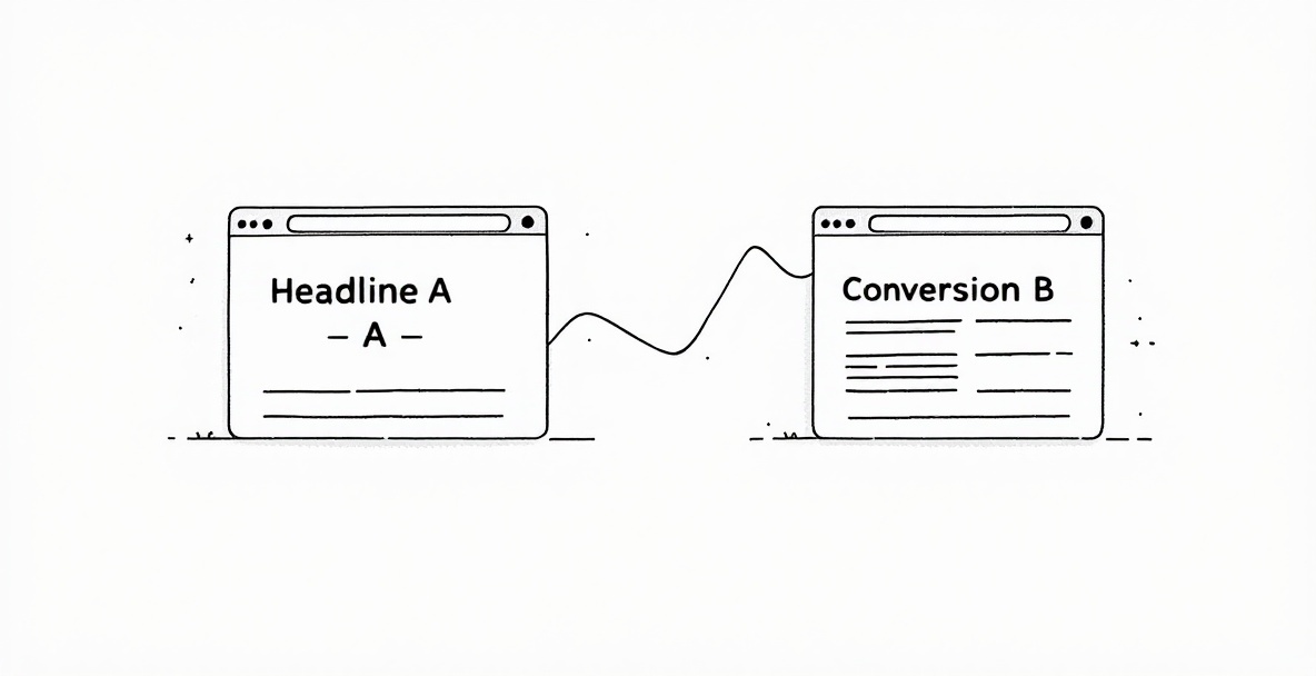
Split testing, sometimes called A/B testing, is about comparing two versions of a webpage or a single element to see which one drives more conversions. You let your visitors see one version or the other and then measure the results. It works like a mini experiment where real user actions tell you what really works instead of relying on gut feelings.
Why You Should Care About Split Testing
Testing removes the guesswork from making changes. Instead of wondering if a new design or message might work, you get clear answers based on real behavior. This process creates a habit of ongoing improvement. A comprehensive study on iterative optimization techniques shows that businesses that test regularly end up growing much faster. Many of our clients began with modest 10-15% gains that later doubled or even tripled their conversions. Testing also saves you from costly mistakes by letting you try changes on a small scale first.
Test #1: Headlines That Make an Impact

Your headline is the very first thing a visitor sees, and it sets the tone for your entire page. A well-crafted headline grabs attention and draws your reader into learning more. The right words can lead visitors straight toward that ultimate conversion.
How to Create a Standout Headline
When testing headlines, think about a few key points. Your headline should clearly tell visitors what benefit they get. Compare a direct message with one that sparks curiosity, and see which one makes people click. Sometimes asking a question can make readers curious, while a strong statement brings immediate clarity. Also, try different lengths. A short, punchy headline might grab a quick click while a longer one can share more of your value. Remember, a small change at the top can have a big ripple effect all the way down the sales funnel.
Real Examples of Winning Headlines
For example, one e-commerce client tested two versions. The first read, "High-Quality Fitness Equipment for Home Workouts," and the second said, "Transform Your Body Without Leaving Home - Guaranteed Results in 30 Days." The second headline boosted conversions by 67% because it was specific and outcome-driven. Another client in the SaaS space compared "Project Management Software for Growing Teams" with "Finish Projects 30% Faster - The Project Tool Teams Actually Use." The clear, quantifiable benefits in the challenger headline led to 41% more demo requests.
Test #2: Calls to Action That Work
Your call-to-action is the bridge from interest to action. Even small tweaks in your CTA can lead to big jumps in conversions. Changing the words, color, or placement of your button can make all the difference.
Crafting a CTA That Connects
Focus on wording that speaks directly to the benefit your visitor will receive. Phrases like "Start Saving Now" or "Get Your Free Guide" feel much more engaging than plain commands like "Submit" or "Click Here." The design matters, too. Try colors that stand out from your page and test different sizes to see what looks the most inviting. Placement is critical as well. In fact, a recent analysis of user engagement patterns revealed that where you put your button can push clicks through the roof.
Success Stories from Strong CTAs
One financial service firm switched from a plain green "Submit Application" button to an orange button that read, "Check My Rate - Won't Affect Credit Score." This simple change boosted application starts by 104%. In another case, a software provider compared a single CTA at the bottom with several CTAs peppered throughout the page using phrases like "See It in Action," "Get a Personalized Demo," and "Start Your Free Trial." The varied approach increased conversions by 58%, proving that context and timing matter.
Test #3: Making Forms Friendly
Forms can be a real barrier if they are too long or confusing. A few tweaks in your form design can lead to dramatic improvements in how many visitors complete them. Even small changes here can lead to big wins.
Smoothing Out the Form Process
Think about reducing the number of fields on your form. Each extra question might slow your visitor down, so only ask for what is absolutely needed. The order of your fields is important too. Start with simple information like a name and email and leave more detailed questions for later. Sometimes breaking a long form into a few steps can make it feel easier. These small enhancements can really boost your form completion rate.
Getting Validation Right
Offering real-time feedback as visitors fill out your form helps them correct mistakes immediately. Rather than a generic error that simply states something is wrong, try a friendlier message such as, "We need a valid email to send you your report." One client dropped their form fields from nine to five and saw completions jump by 63%. Others used a method where extra questions only appear after the basics are filled and improved their conversion rate by 48%.
Test #4: Putting Social Proof in the Spotlight

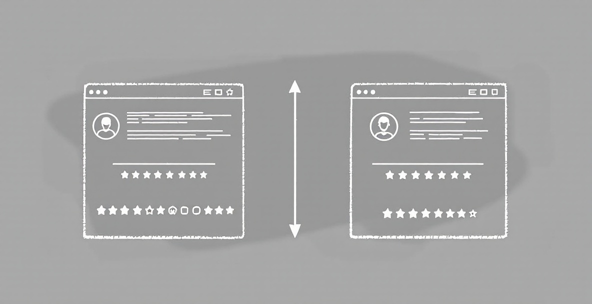
Seeing proof from others can build trust quickly. Adding testimonials, badges, or usage numbers can give visitors the confidence they need to convert. However, where and how you show these signals can make a big difference.
Experimenting with Trust Elements
Try different approaches with your testimonials. Detailed reviews with ratings might work better than short, generic praise. Badges, like certification seals or partner logos, add instant credibility. Even the way you present numbers matters. For example, "Join 10,427 satisfied customers" might feel more impactful than "Trusted by over 10,000 businesses." The goal is to find the type of social proof that best reassures your visitors.
Fine-Tuning Social Proof Placement
Test various placements for your trust elements. See if placing testimonials near pricing details works better than near your call-to-action. Sometimes a video testimonial catches the eye better than a block of text. One client moved testimonials next to pricing and saw sign-ups jump by 38%. In another test, video testimonials resulted in a 27% increase in conversions compared to text alone.
Test #5: Clarity in Your Value Proposition
How you communicate what makes your offer special can change your results dramatically. Testing different ways to explain your value helps you find the best fit for your audience.
Putting Features Against Benefits
Try lining up the technical details of your offer against the emotional rewards. Some visitors may want to know exactly which features they are getting, while others care more about how things will improve their lives. Experiment by framing your message around solving a problem versus painting a picture of a better future. In some cases, detailed features worked best, and in others, a focus on benefits drove more action. It all depends on who is reading your page.
Different Ways to Share Your Value
Sometimes a picture or video can do the talking for you. Showing side-by-side comparisons or before-and-after scenarios can make your value more clear. One e-commerce client saw a 41% lift in conversions when they highlighted sustainability benefits rather than just listing technical features. Finding the right mix of words and visuals is key to showing the true worth of your offer.
Test #6: Streamlined Page Layouts and Visual Focus

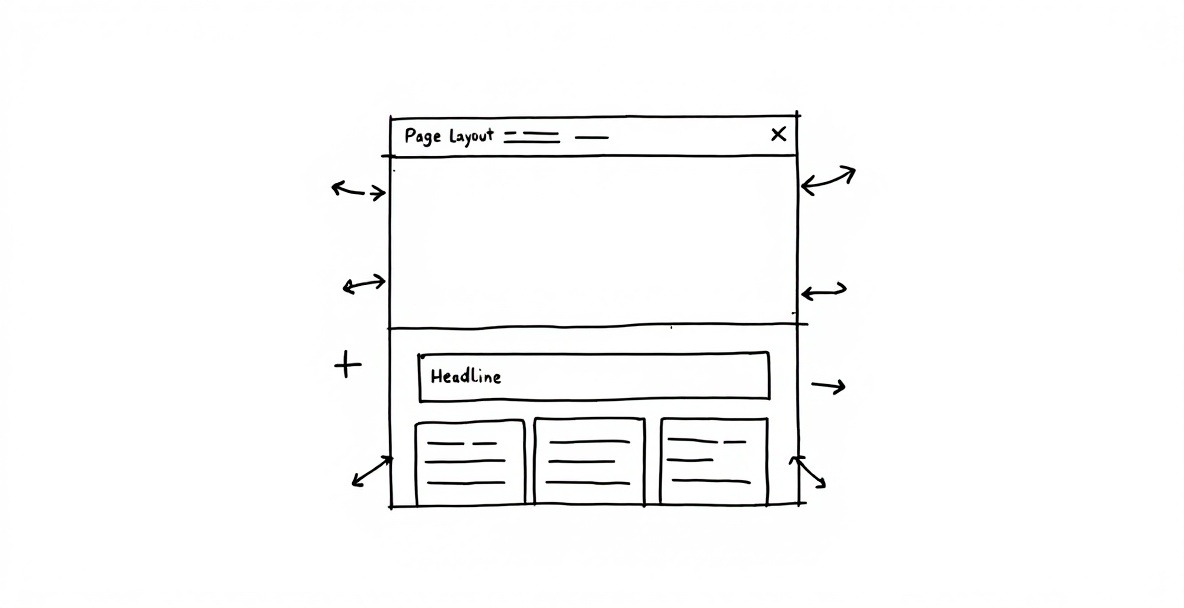
A clear page layout directs your visitors naturally through your story. The way you organize your content tells them where to look first. Even small tweaks in visual focus can improve your conversion rate considerably.
Creating a Clear Path for Your Visitors
Try reordering your content to see what works best. Some visitors might respond better if you introduce a problem first before revealing your solution. Others may prefer a straightforward approach that immediately highlights the benefits. Adjusting how much detail you provide on one page can also help visitors understand your offer faster. Using a tool like GoStellar can guide you in finding the best flow without slowing your page down.
Trying Out Different Layouts
Decide if a single-column design or a multi-column layout works better for your message. Playing with image sizes, text blocks, and button placements can shift attention to key points. For instance, one client in the education field saw a 36% jump in course enrollments after changing to a layout that made information clearer. How your content is organized may matter just as much as what you say.
Test #7: Tailoring Content for Each Visitor
Personalizing your content can make visitors feel like the page was built just for them. When you adjust your website based on where someone comes from or what they do, you build a stronger connection and encourage action.
Trying Out Custom Content Options
See if changing headlines or calls-to-action based on the visitor's source makes a difference. You can also tailor parts of your message for first-time guests versus returning fans. With GoStellar tools, setting up tests to show different messages for different groups is simple. This kind of fine-tuning helps ensure your content always feels relevant.
Measuring the Impact of Personal Touches
Compare personalized experiences with a one-size-fits-all approach. Sometimes even a small touch, like mentioning the visitor's name, can go a long way; other times, deeper customization may be needed. One client saw a 53% boost in demo requests after showing location-specific case studies to different regions. Testing these personal touches helps you fine-tune your message so it always strikes home.
Ready to Give Your Conversions a Real Boost?
Testing is not about making tiny tweaks; it is about finding changes that can truly transform your business. The seven tests shared here have a proven record of lifting conversion rates, sometimes doubling or tripling them over time. Each test focuses on a core part of your sales process-from headlines and forms to social proof and personalization. If you want to see real growth, start experimenting with these areas and watch your numbers climb.
Ready to double your conversion rates without slowing down your site? Start your journey with GoStellar today and discover how our ultra-lightweight 5.4KB script can work wonders for your business. Experience the power of smart testing while keeping your website blazing fast.
Published: 5/6/2025