
Top Common Landing Page Errors CRO Teams Must Avoid in 2025
Landing pages can make or break your online sales, yet even the best marketing teams fall into the same traps year after year. Think about this—just adding one extra form field can increase abandonment rates by up to 50 percent. Most teams focus on flashy graphics and killer copy, but that’s not where conversions slip through your fingers. The real conversion killers are often hiding in plain sight, waiting to quietly chip away at your results.
Table of Contents
- Critical Mistakes That Hurt Conversions
- User Experience Flaws That Reduce Engagement
- Content And Messaging Errors You Must Fix
- Proven Tips To Prevent Landing Page Mistakes
Quick Summary
| Takeaway | Explanation |
|---|---|
| Minimize form fields to boost conversions | Reducing unnecessary fields on forms significantly decreases abandonment rates and enhances user comfort during submission. |
| Optimize page loading speed for better performance | Ensuring pages load within three seconds keeps users engaged and reduces frustration that leads to exits. |
| Clarify value propositions in headlines | Compelling and specific headlines need to articulate user benefits, avoiding generic or vague language to maintain interest. |
| Use clear and actionable calls-to-action | Calls-to-action should feature actionable language and prominent design to guide users smoothly toward conversion. |
| Simplify content and design for improved engagement | Streamlined information and consistent design reduce cognitive overload, making it easier for users to focus and engage effectively. |
Critical Mistakes That Hurt Conversions
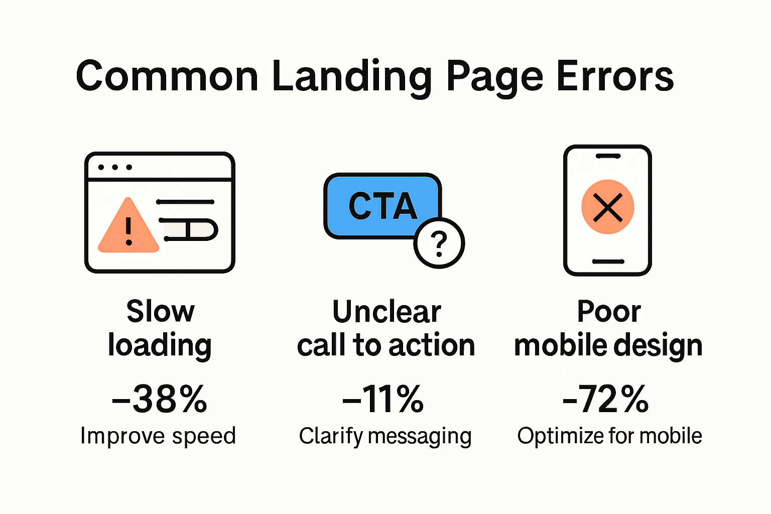
Conversion rate optimization demands precision. Even small errors can dramatically reduce landing page performance and push potential customers away. Understanding and eliminating these critical mistakes becomes paramount for marketers seeking to maximize their digital conversion strategies.
Form Friction: The Silent Conversion Killer
Landing page forms represent the critical junction between user interest and actual conversion. However, many marketers unknowingly create barriers that prevent potential customers from completing their journey. Research from Martech Zone reveals that excessive form fields dramatically increase abandonment rates. Asking visitors to provide extensive personal details upfront creates psychological resistance.
The most common form-related conversion errors include:
- Overwhelming Field Quantity: Requesting multiple unnecessary details like full addresses, phone numbers, or extensive background information
- Complex Input Requirements: Creating confusing validation rules that frustrate users
- Lack of Clear Value Proposition: Not explaining why users should submit their information
Successful conversion optimization requires strategic form design that minimizes friction while maximizing user comfort and perceived value.
To better visualize the types of form friction and their impact, the table below summarizes the main form-related errors and their effects on conversion rates:
| Form Error Type | Description | Impact on Conversions |
|---|---|---|
| Overwhelming Field Quantity | Too many fields or requests for unnecessary details | Increases abandonment and resistance |
| Complex Input Requirements | Confusing validation or input formats | Causes user frustration and drop-offs |
| Lack of Clear Value Proposition | No clear reason why information is needed | Reduces trust and completion rates |
Performance Bottlenecks That Destroy User Experience
Web design research consistently demonstrates that page loading speed directly impacts conversion rates. Slow-loading pages create immediate user frustration, causing potential customers to abandon the site within seconds.
Technical performance issues that devastate conversions include:
- Extended Load Times: Pages taking more than 3 seconds to load
- Unoptimized Images: Large file sizes that consume bandwidth
- Complex Scripts: Unnecessary JavaScript that delays interactivity
Every millisecond matters. Websites must prioritize performance optimization to maintain user engagement and prevent premature exits.
Visual Clarity and Messaging Misalignment
Experts from CMSwire emphasize that landing page design is more than aesthetic appeal. The placement of critical elements like forms, headlines, and calls-to-action significantly impacts conversion potential.
Common visual communication mistakes include:
- Cluttered Layout: Overwhelming users with too much information
- Weak Value Proposition: Failing to communicate unique benefits clearly
- Inconsistent Messaging: Disconnects between ad copy and landing page content
Effective landing pages communicate purpose instantly. They guide users seamlessly from initial interest to desired action through intentional, strategic design.
Marketers must approach landing page optimization as a holistic discipline. By systematically addressing form friction, performance bottlenecks, and visual communication challenges, teams can transform underperforming pages into powerful conversion engines.
User Experience Flaws That Reduce Engagement
User experience represents the invisible architecture that determines whether visitors stay engaged or quickly abandon a landing page. Understanding the nuanced factors that contribute to poor user engagement becomes critical for marketers seeking to create compelling digital experiences.
Content Complexity and Cognitive Overload
Research from academic studies reveals a direct correlation between content volume and user disengagement. The counterintuitive reality is that more information does not translate to better user understanding. When landing pages overwhelm visitors with excessive text, complex explanations, or intricate details, the cognitive load increases exponentially.
Significant content-related engagement barriers include:
- Information Density: Presenting too much technical or descriptive information simultaneously
- Complex Language: Using industry jargon or unnecessarily sophisticated terminology
- Lack of Visual Hierarchy: Failing to guide users through content with clear structural cues
Successful landing pages communicate value through strategic simplification, allowing users to quickly comprehend the core message without mental strain.

Design Inconsistency and Navigation Challenges
Comprehensive design research identifies seven critical website design elements that profoundly impact user engagement. Navigation emerges as a particularly crucial factor determining whether visitors explore further or exit immediately.
Common design flaws that disrupt user experience include:
- Unclear Navigation Paths: Confusing menu structures that make finding information difficult
- Inconsistent Visual Language: Misaligned color schemes, typography, or interaction patterns
- Non-Intuitive Interface Elements: Buttons or links that do not behave as users expect
For a quick reference, the following table summarizes user experience barriers and their potential consequences on engagement:
| UX Barrier | Example | Effect on Engagement |
|---|---|---|
| Unclear Navigation Paths | Complicated menus, hidden links | Users abandon before exploring further |
| Inconsistent Visual Language | Mismatched colors, varying fonts | Loss of trust and professionalism |
| Non-Intuitive Interface Elements | Buttons that don't act as expected | Frustration, less interaction |
Effective landing page design creates an intuitive journey, anticipating user needs and reducing cognitive friction through thoughtful, consistent interaction design.
Content Quality and Readability Challenges
Usability studies consistently highlight the profound impact of content quality on user engagement. Grammatical errors, unclear messaging, and poor readability can swiftly erode user trust and interest.
Content-related engagement barriers encompass:
- Grammatical Inconsistencies: Spelling mistakes or awkward sentence structures
- Lack of Clarity: Ambiguous messaging that fails to communicate value proposition
- Irrelevant Information: Content that does not directly address user expectations
Precise, concise, and purposeful content serves as the foundation of exceptional user experience. By prioritizing clarity, relevance, and accessibility, marketers can transform landing pages from potential friction points into compelling conversion platforms.
Marketers must approach user experience holistically. By systematically addressing content complexity, design inconsistencies, and communication challenges, teams can create landing pages that not only capture attention but sustain genuine user interest and drive meaningful conversions.
Content and Messaging Errors You Must Fix
Effective landing page content serves as the critical bridge between user interest and conversion. However, numerous messaging pitfalls can derail even the most promising marketing efforts. Understanding and rectifying these content errors becomes essential for creating compelling digital experiences that truly resonate with target audiences.
Weak Value Proposition and Headline Challenges
Research from ScoreApp reveals that a lack of clear value proposition represents one of the most significant content failures. Visitors make split-second decisions about engaging with a page, and an ambiguous or generic headline can immediately push potential customers away.
Critical value proposition mistakes include:
- Vague Messaging: Using broad, non-specific language that fails to communicate unique benefits
- Feature-Focused Copy: Emphasizing technical details instead of solving user problems
- Missing Emotional Connection: Failing to address the underlying motivations and pain points of the target audience
Successful landing pages craft headlines that instantly communicate value, creating an immediate and compelling reason for users to continue reading.
Call-to-Action Ineffectiveness
UserTesting experts highlight the critical importance of clear, actionable calls-to-action. CTAs represent the pivotal moment where interest transforms into conversion, and poorly designed CTAs can create substantial friction in the user journey.
Common CTA-related content errors include:
- Unclear Action Language: Using vague or passive language that doesn't specify the exact outcome
- Poor Visual Prominence: Designing CTAs that blend into the page or fail to stand out
- Misaligned Messaging: Creating a disconnect between the page content and the call-to-action
Optimal CTAs provide crystal-clear direction, using action-oriented language that creates a sense of immediacy and value.
Audience Misalignment and Generic Content
Zoho research demonstrates the critical need for targeted, personalized content. Generic messaging that attempts to speak to everyone ultimately speaks to no one effectively.
Significant content personalization challenges include:
- One-Size-Fits-All Approach: Using identical content across different audience segments
- Lack of Contextual Relevance: Failing to adapt messaging based on traffic source or user intent
- Missed Personalization Opportunities: Not leveraging available data to create more targeted experiences
Advanced marketers recognize that true engagement comes from creating content that feels specifically crafted for individual user needs and perspectives.
Transforming landing page content requires a strategic approach that prioritizes clarity, specificity, and user-centric messaging. By systematically addressing value proposition weaknesses, CTA ineffectiveness, and content genericism, marketers can develop landing pages that not only capture attention but drive meaningful conversions with precision and impact.
Proven Tips to Prevent Landing Page Mistakes
Successful landing page optimization requires a strategic approach that anticipates and mitigates potential conversion barriers. By implementing targeted techniques, marketers can transform underperforming pages into powerful conversion engines that effectively guide users through their digital journey.
Strategic Information Placement and Visibility
Zoho's comprehensive guide emphasizes the critical importance of information hierarchy and immediate visibility. The first few seconds of user interaction determine whether visitors will engage or abandon the page.
Key strategies for optimizing information placement include:
- Above the Fold Prioritization: Positioning most critical information and value propositions in the top visible section
- Visual Hierarchy: Using design elements to guide user attention toward key messages
- Concise Messaging: Communicating core benefits quickly and clearly
Effective landing pages create an instant connection by presenting the most compelling information where users can immediately perceive value.
Crafting Compelling and Focused Calls-to-Action
Well Web Design experts highlight the transformative power of strategic call-to-action design. CTAs represent the critical conversion point where user interest transforms into tangible action.
Essential CTA optimization techniques include:
- Action-Oriented Language: Using clear, direct verbs that communicate exact outcomes
- Visual Distinctiveness: Designing CTAs that stand out through color, size, and placement
- Psychological Triggers: Incorporating urgency, scarcity, or benefit-driven messaging
A well-crafted CTA removes ambiguity and provides users with a clear, compelling pathway to conversion.
Simplifying User Interactions and Building Trust
UX Design World research underscores the importance of minimizing complexity and establishing credibility. Multiple CTAs can fragment user attention, while strategic trust signals can significantly enhance conversion potential.
Trust-building and interaction simplification strategies include:
- Single, Focused CTA: Eliminating competing actions that dilute user focus
- Social Proof Integration: Incorporating testimonials, case studies, and credibility markers
- Minimal Form Requirements: Requesting only essential information to reduce friction
Successful landing pages create a seamless, trustworthy experience that guides users effortlessly toward their desired outcome.
Landing page optimization is an ongoing process of refinement and strategic adaptation. By systematically addressing information placement, CTA design, and user interaction complexity, marketers can create high-performing digital experiences that consistently drive meaningful conversions. The key lies in understanding user psychology, eliminating unnecessary barriers, and providing clear, compelling pathways to action.
Frequently Asked Questions
What are the most common landing page errors to avoid in 2025?
Some common landing page errors to avoid include excessive form fields, slow loading speeds, vague value propositions, unclear calls-to-action, and complex content that overwhelms users.
How can form friction impact conversion rates?
Form friction can significantly increase abandonment rates, causing up to 50% of users to leave if they encounter too many fields or complex input requirements during the submission process.
Why is page loading speed important for landing pages?
Page loading speed is crucial because slow-loading pages can frustrate users, leading to higher bounce rates. Optimally, pages should load within three seconds to retain visitor engagement.
What strategies can improve call-to-action effectiveness?
To improve call-to-action effectiveness, use clear and action-oriented language, ensure CTAs stand out visually, and align the messaging with the content of the landing page to encourage conversions.
Ready to Eliminate Landing Page Conversion Barriers?
If you have ever struggled with overwhelming form friction, slow user experiences, or underperforming calls-to-action, you are not alone. As highlighted in the article, these common landing page errors can devastate your conversion rates and leave valuable opportunities untapped. Stellar gives you the power to fix these challenges fast by offering lightweight, real-time A/B testing and a visual editor built for non-technical marketers.
Take control today and transform your landing page results in minutes. Start by exploring the A/B Testing Tool that empowers you to test everything from headline clarity to CTA language without code or complexity. Discover how real-time analytics and dynamic keyword insertion address the exact pain points detailed in this guide. The time to accelerate your conversions is now. Visit Stellar and move your team ahead of landing page pitfalls for good.
Published: 7/24/2025