
Ecommerce Checkout Optimization: 2026 Conversion Guide
TL;DR:
- Ecommerce checkout optimization focuses on enhancing design and technical performance to reduce cart abandonment and boost sales. Implementing best practices like guest checkout, shorter forms, transparent fees, and mobile wallet placement significantly improve conversion rates. Prioritizing backend payment engineering, micro-interaction tracking, and continuous testing leads to sustainable improvements in checkout success.
Ecommerce checkout optimization is the practice of systematically improving checkout design, functionality, and technical architecture to reduce cart abandonment and increase completed sales. The average store loses roughly 70% of shoppers before they complete a purchase, and the majority of those exits happen inside the checkout itself. Fixing that leak does not require a full redesign. Baymard Institute research confirms that well-executed UX changes alone can lift checkout conversion by up to 35.26%. This guide covers the exact levers, from form field reduction and payment engineering to mobile-specific fixes and A/B testing, that move the needle in 2026.
What are the most effective checkout process best practices?
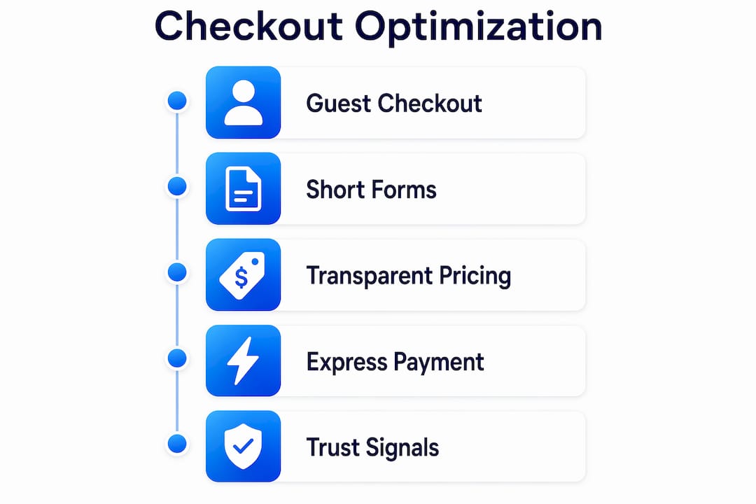
The single highest-impact change most stores can make is enabling guest checkout. Forcing account creation before purchase is one of the top reasons shoppers abandon. Removing that barrier costs you nothing and immediately reduces friction for first-time buyers. Shopify merchants who surface guest checkout prominently consistently report lower abandonment rates than those who default to account-required flows.

Form length is the second major lever. Reducing form fields from the industry average of 12 down to 7 or 8 improves conversion by 25 to 35 percent. Every field beyond eight drops completion rate by an additional 4 to 6 percent. That means a 12-field form is not just annoying. It is statistically costing you orders.
Transparent pricing matters just as much as form design. Surprise shipping fees cause 48% of checkout abandonment. Displaying shipping costs, taxes, and any additional fees at the cart stage rather than the final payment screen eliminates the most common reason shoppers bail at the last step.
Express checkout buttons from Apple Pay, Google Pay, and Shop Pay deserve prominent placement above the fold on both desktop and mobile. Wallet adoption increases 15 to 25 percent when these buttons appear above the fold, and digital wallets now drive 38% of completed mobile checkouts. Placing them below the fold or only at the end of a multi-step flow leaves significant conversion on the table.
Trust signals at the payment step close the loop. SSL badges, recognized payment logos (Visa, Mastercard, PayPal), and short return policy reminders placed near the "Place Order" button reduce last-second hesitation. These signals cost nothing to implement and address the anxiety that spikes right before a shopper commits.
Pro Tip: Test one-page scrollable checkout against your current multi-step flow. Single-page checkout reduces abandonment by about 20% on average because it gives shoppers full visibility into progress without the uncertainty of not knowing how many steps remain.
How to reduce checkout friction through payment engineering
Most checkout improvements focus on visual design, but the biggest gains often come from backend and payment-layer changes. These fixes require more technical lift but deliver outsized results.
-
Implement address autocomplete. Address autocomplete cuts form completion time from 45 seconds down to 8 seconds and reduces drop-off by 40 to 60 percent. Google Places API and similar services integrate directly into Shopify, WooCommerce, and custom builds. This is one of the highest-ROI technical changes available.
-
Move shipping calculation to the cart. Calculate shipping using the shopper's geolocation or a stored default rate before they reach checkout. This eliminates the surprise fee problem at its source rather than just displaying fees earlier in the UI.
-
Embed native payment inputs. Redirecting shoppers to an external payment page (a common pattern with older PayPal integrations) introduces a context switch that increases abandonment. Embedding Stripe Elements or Braintree's hosted fields keeps the shopper on your domain throughout.
-
Write specific payment error messages. Generic "payment failed" messages cause shoppers to give up. Specific error messages with clear retry paths recover 30 to 50 percent of failed payments. Tell the shopper exactly what went wrong ("Your card's billing address does not match") and offer an alternative payment method immediately.
-
Use adaptive payment ordering. Stripe's Adaptive Payment Ordering automatically surfaces the most relevant payment method for each individual shopper based on their location, device, and behavior. This technology delivers an 11 to 14 percent lift in completed carts by solving payment friction that has nothing to do with price or intent.
-
Persist carts across sessions and devices. A shopper who starts checkout on mobile and returns on desktop should find their cart intact. Session persistence reduces re-entry friction and recovers shoppers who were interrupted rather than genuinely uninterested.
| Technical fix | Estimated impact | Implementation complexity |
|---|---|---|
| Address autocomplete | 40–60% drop-off reduction | Low to medium |
| Adaptive payment ordering (Stripe) | 11–14% conversion lift | Medium |
| Native payment embedding | Reduces redirect abandonment | Medium |
| Specific error messages with retry | 30–50% failed payment recovery | Low |
| Cart persistence across devices | Recovers interrupted sessions | Medium to high |
Pro Tip: Prefetching the checkout page while the shopper is still on the cart page reduces load-time abandonment significantly. Most modern frameworks support prefetch directives with a single line of code.
What mobile optimization strategies are critical for checkout success?
Mobile accounts for the majority of ecommerce traffic in 2026, yet mobile checkout conversion rates consistently lag behind desktop. The gap is not a design problem. It is an input problem. Shoppers on mobile hate typing, and most checkouts are still built around keyboard-heavy desktop flows.
- Lead with digital wallets. Apple Pay and Google Pay eliminate address and card entry entirely. Place these buttons at the very top of the checkout page on mobile, before any form fields appear. The conversion gains from wallets come specifically from removing the typing burden, not just from brand familiarity.
- Trigger the right keyboard. Set input fields to call the numeric keypad for phone numbers and card numbers, and the email keyboard for email fields. This single change reduces input errors and speeds up form completion without any visual redesign.
- Collapse the order summary by default. A long order summary pushed above the payment fields forces mobile users to scroll past it on every page. Collapse it into a tappable accordion so the payment form is immediately visible.
- Test single-page vs. multi-step on mobile specifically. The optimal checkout format is device-specific and user-segment-specific. Multi-step can reduce cognitive load on mobile by breaking the process into digestible chunks, but single-page reduces uncertainty. Run the test on mobile traffic separately from desktop.
- Prefetch and preload aggressively. Mobile networks are inconsistent. Prefetching the next checkout step while the shopper completes the current one prevents load-time drop-off that desktop users rarely experience. This is especially important for shoppers on 4G connections in rural areas.
Reducing the number of form fields matters even more on mobile than on desktop. The same 7 to 8 field maximum applies, but the penalty for exceeding it is steeper because typing on a small screen is slower and more error-prone.
How to measure and continuously improve checkout conversion
You cannot fix what you cannot see. Most analytics setups track funnel drop-off at the page level, which tells you where shoppers leave but not why. Effective checkout process improvement requires micro-interaction tracking: which fields cause the most edits, where validation errors appear, and which payment methods get selected and then abandoned.
- Track field-level abandonment. Tools like Hotjar and FullStory record form interactions at the field level. If 40% of shoppers who reach your address field abandon the checkout, that is a specific, fixable problem. Page-level analytics would only show you that people left the checkout page.
- Instrument payment method selection. Track not just which method shoppers select, but which ones they select and then fail to complete. A high selection-to-abandonment rate on a specific method points to a UX or technical issue with that method's integration.
- Audit error messages. Pull your payment processor's decline data (Stripe Dashboard's Payment Method Performance report is the standard reference) and categorize declines by type. Soft declines (insufficient funds, temporary holds) are recoverable with retry logic. Hard declines (invalid card numbers) need clear messaging.
- Prioritize fixes by impact and ease. A fix that takes two hours and recovers 15% of failed payments outranks a fix that takes two weeks and recovers 5% of abandonment. Build a simple impact-versus-effort matrix before your next sprint.
Pro Tip: A/B testing checkout elements requires a tool that does not slow your page down. Gostellar's 5.4KB script adds testing capability without the performance penalty that heavier testing platforms introduce at the checkout step, where every millisecond of load time affects conversion.
Checkout losses frequently stem from payment choice friction rather than price hesitancy. A shopper who abandons after selecting a payment method was ready to buy. Fixing the payment layer recovers revenue that better product pages or lower prices cannot.
Key takeaways
Ecommerce checkout optimization delivers the highest conversion ROI when it combines UX simplification, payment engineering, and continuous measurement rather than treating any single fix as sufficient.
| Point | Details |
|---|---|
| Guest checkout and short forms | Remove forced account creation and cap form fields at 7 to 8 to cut abandonment immediately. |
| Show fees early | Display shipping costs and taxes at the cart stage to eliminate the surprise that drives 48% of abandonment. |
| Payment engineering over UI | Address autocomplete, adaptive payment ordering, and native embedding outperform visual redesigns in conversion impact. |
| Mobile-first wallet placement | Put Apple Pay and Google Pay above the fold on mobile before any form fields appear. |
| Measure micro-interactions | Track field-level errors and payment method abandonment, not just page-level drop-off, to locate real friction. |
Why checkout optimization is still misunderstood in 2026
Most teams I work with treat checkout as a design problem. They redesign the layout, update the color of the "Place Order" button, and wonder why conversion barely moves. The real gains are almost always in the engineering layer: where data gets computed, how errors get communicated, and which payment methods get surfaced to which shoppers.
The emergence of Stripe's Adaptive Payment Ordering is the clearest proof of this. An 11 to 14 percent lift from reordering payment methods is larger than most full checkout redesigns deliver. That result comes from a backend algorithm, not a new button color. Teams that understand this stop asking "how should this look?" and start asking "where is the data computation happening, and is it happening too late?"
I also think the industry underestimates how much A/B testing matters specifically at the checkout step. Most ecommerce conversion optimization testing happens on product pages and homepages because those are easier to test and the traffic is higher. But a 5% lift at checkout is worth more than a 15% lift on a product page because checkout traffic is already high-intent. Testing checkout elements with a lightweight tool that does not add latency is one of the highest-leverage activities a growth team can run in 2026.
The uncomfortable truth is that most checkout audits never happen at all. Teams ship a checkout, move on, and only revisit it when abandonment becomes a crisis. Build a quarterly checkout review into your roadmap. Treat it like infrastructure maintenance, not a one-time project.
— Juan
Test your checkout assumptions with Gostellar
If you are running checkout experiments with a tool that adds 50KB or more to your page weight, you are introducing the very friction you are trying to eliminate. Gostellar is built specifically for performance-sensitive pages like checkout, with a 5.4KB testing script that runs A/B tests without slowing your funnel. The no-code visual editor lets you test form layouts, button placement, and payment method order without waiting on a developer. Real-time analytics surface results fast enough to act on them within a single sprint cycle. For ecommerce teams serious about checkout process improvement, Gostellar removes the tradeoff between testing speed and page performance.
FAQ
What is ecommerce checkout optimization?
Ecommerce checkout optimization is the process of improving checkout design, technical architecture, and payment flows to reduce cart abandonment and increase completed purchases. It covers everything from form field reduction to payment error handling.
What causes the most cart abandonment at checkout?
Surprise shipping costs cause 48% of checkout abandonment, making early fee disclosure the single most impactful fix. Forced account creation and excessive form fields are the next most common causes.
How many form fields should a checkout have?
Checkout forms should have 7 to 8 fields maximum. Completion rates drop 4 to 6 percent for every field added beyond eight, with the penalty being steeper on mobile devices.
Does one-page checkout always outperform multi-step?
Not always. Single-page checkout reduces abandonment by about 20% on average, but the optimal format depends on device type and user segment. Test both formats separately on mobile and desktop traffic before committing.
How does A/B testing improve checkout conversion?
A/B testing identifies which specific changes, such as button placement, form layout, or payment method order, actually lift conversion for your audience rather than relying on general best practices. Tools like Gostellar let you run these tests without adding page weight that undermines checkout performance.
Recommended
Published: 6/2/2026