
Good user experience: Principles, testing, and tactics
TL;DR:
- Good UX focuses on usability, accessibility, satisfaction, and mental model alignment, not aesthetics.
- Measuring UX with metrics like conversion rate, Core Web Vitals, and the HEART framework guides improvements.
- Continuous testing, iteration, and integrating user data build sustained growth and better user experience.
Most marketers treat user experience as a design problem. It isn't. It's a revenue problem. UX investment can yield a 9,900% ROI, which means every dollar you put into improving how people move through your site can return a hundred. The challenge isn't convincing people that UX matters. The challenge is knowing what "good" actually looks like when your conversion rates are flat, your bounce rate is creeping up, and your team is debating button colors instead of solving real friction. This guide cuts through that noise with clear principles, measurable benchmarks, and a practical A/B testing framework you can act on today.
Table of Contents
- Core principles of a good user experience
- How to measure and benchmark good user experience
- A/B testing: The marketer's toolset for UX improvement
- User-centric design strategies for sustained growth
- Why the best UX strategies blend agility, evidence, and continuous iteration
- Take your user experience to the next level
- Frequently asked questions
Key Takeaways
| Point | Details |
|---|---|
| Principles matter | Good UX means intuitive, accessible, and consistent interfaces that put user needs first. |
| Measure your impact | Track quantitative UX metrics such as Core Web Vitals, conversion rates, and the HEART framework for continuous improvement. |
| A/B testing is essential | Data-driven testing reveals what truly boosts experience and results without guesswork. |
| Iterate continuously | Ongoing, evidence-based adjustments compound over time for lasting growth. |
Core principles of a good user experience
With the business case for UX clear, let's examine the foundational principles that define what "good" looks like.
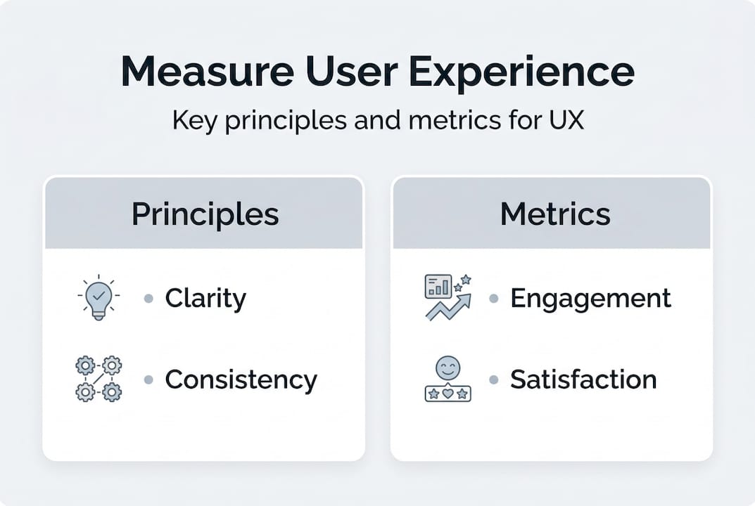
Good UX isn't about aesthetics. A beautiful page that confuses users is a liability, not an asset. At its core, good UX prioritizes usability, accessibility, low cognitive load, satisfaction, and alignment with user mental models. These six dimensions work together, and a weakness in any one of them will undermine the others.
Here's a quick breakdown of each:
- Usability: Users can complete their intended task without confusion or unnecessary steps. Think of a checkout process that remembers your address or a form that auto-formats phone numbers.
- Accessibility: Your site works for everyone, including users with visual impairments, motor limitations, or slow internet connections. This isn't optional, and it's often the easiest UX win to miss.
- Satisfaction: Users leave feeling positive about the interaction. This is emotional, but it's measurable through NPS surveys and repeat visit rates.
- Intuitive design: The layout matches what users expect before they even read a label. Navigation should feel obvious, not learned.
- Low cognitive load: Users shouldn't have to think hard to use your site. Every extra choice or unclear label adds mental friction and reduces completion rates.
- Alignment with mental models: Users bring assumptions from other websites. If your checkout flow breaks those assumptions, expect drop-off.
Jakob Nielsen's 10 Usability Heuristics give you a practical checklist for auditing any page. The most applicable ones for marketers are:
Nielsen's 10 Usability Heuristics (summary):
- Visibility of system status
- Match between system and the real world
- User control and freedom
- Consistency and standards
- Error prevention
- Recognition rather than recall
- Flexibility and efficiency of use
- Aesthetic and minimalist design
- Help users recognize, diagnose, and recover from errors
- Help and documentation
Apply these to something concrete: an email sign-up form. Does it show a progress indicator (heuristic 1)? Does the error message actually tell you what went wrong (heuristic 9)? Does it remember your data if the page refreshes (heuristic 3)? Running through this list on your highest-traffic pages takes under an hour and often surfaces obvious friction you'd stopped noticing.
These principles matter because they reduce confusion and increase task completion. When users don't have to stop and think, they move forward. When they hit friction, they leave. Reducing that friction, even slightly, compounds across thousands of sessions into measurable revenue gains.
How to measure and benchmark good user experience
Understanding principles is just the start. Measuring UX is what helps you actually improve results.

You can't optimize what you can't measure. For marketers running tests on landing pages, product pages, or sign-up flows, the key quantitative metrics to track are: conversion rate, bounce rate, average session duration, Net Promoter Score (NPS), and Core Web Vitals.
Core Web Vitals deserve special attention. Google's Chrome UX Report provides empirical benchmarks that define what "good" looks like at scale. The three signals are:
- LCP (Largest Contentful Paint): How fast your main content loads. Under 2.5 seconds is good.
- INP (Interaction to Next Paint): How quickly the page responds to user input. Under 200 milliseconds is good.
- CLS (Cumulative Layout Shift): How much content jumps around while loading. A score under 0.1 is good.
These aren't just SEO metrics. They directly reflect how users experience your page in real time. A slow LCP means users are staring at a blank screen. A high CLS means they're clicking the wrong button because the layout shifted under them.
For a more holistic view, use the HEART framework, which defines five dimensions: Happiness, Engagement, Adoption, Retention, and Task Success. Each dimension maps to specific metrics you can track in your analytics platform.
| Dimension | What it measures | Example metric |
|---|---|---|
| Happiness | User satisfaction | NPS, post-interaction survey score |
| Engagement | Depth of interaction | Pages per session, scroll depth |
| Adoption | New feature or page uptake | New user sign-ups, feature activation rate |
| Retention | Return behavior | 30-day return rate, churn rate |
| Task Success | Goal completion | Form completion rate, purchase conversion |
Here's a benchmark table to give you real targets:
| UX metric | Poor | Average | Best-in-class |
|---|---|---|---|
| LCP (load time) | Over 4s | 2.5s to 4s | Under 2.5s |
| INP (interaction) | Over 500ms | 200ms to 500ms | Under 200ms |
| Bounce rate (landing pages) | Over 70% | 40% to 70% | Under 40% |
| NPS | Under 0 | 0 to 30 | Over 50 |
| Form completion rate | Under 20% | 20% to 50% | Over 60% |
The bottom line: good UX investment doesn't just feel better. Studies show it can boost SME revenue by up to 32%, and the widely cited figure of $1 in UX returning $100 makes the ROI calculation straightforward. Use these benchmarks as your baseline, then test systematically to move the needle.
A/B testing: The marketer's toolset for UX improvement
Now let's move from measurement to action. How do you systematically optimize UX? Enter A/B testing.
A/B testing is the most direct method for answering the question "does this change actually help users?" You form a hypothesis, make one change, split your traffic, and let behavior tell you what works. Following effective methodologies means running tests long enough to reach statistical significance, focusing on one variable at a time, and measuring practical impact, not just a p-value.
Here's a workflow that works for SMB marketing teams:
- Form a hypothesis. Start with a specific problem: "Users are dropping off the pricing page because the CTA button is below the fold." Your hypothesis is: "Moving the CTA above the fold will increase clicks by 15%."
- Isolate one variable. Only change the CTA placement. Don't simultaneously change the button color or copy. Multiple changes make it impossible to know what drove the result.
- Set your sample size in advance. Use a sample size calculator before you start. Running a test until it "looks good" inflates false positives dramatically.
- Run for at least two weeks. One week isn't enough to account for weekday and weekend behavioral differences. Two weeks is the practical minimum.
- Analyze confidence and significance. A 95% confidence level is standard, but also ask: is this lift actually meaningful to the business? A 0.2% conversion improvement on 500 monthly visitors isn't worth your optimization effort.
- Iterate based on what you learned. Even failed tests teach you something. Document the result and build on it.
Headline tests often yield 10% to 50% conversion lifts, making them one of the highest-return tests you can run. If you're looking for places to start, a good A/B testing guide and a solid list of headline test ideas will help you build a test backlog quickly.
Here's a comparison of testing approaches to help you choose the right method:
| Approach | Pros | Cons |
|---|---|---|
| Frequentist testing | Widely understood, easy to communicate | Requires fixed sample size in advance, peeking inflates false positives |
| Bayesian testing | Flexible, updates in real time, better for low-traffic sites | More complex to explain to stakeholders |
| Quantitative (A/B data) | Scalable, objective, statistically reliable | Tells you what happened, not why |
| Qualitative (user interviews, sessions) | Explains the "why" behind the numbers | Time-intensive, harder to scale |
Pro Tip: Never check your test results daily and make decisions based on early trends. This "peeking" problem is one of the most common errors in A/B testing. It artificially inflates the chance of a false positive, meaning you'll ship changes that don't actually work. Set your end date before you start and stick to it. For more guidance on avoiding this and other pitfalls, the A/B testing best practices resource covers the full list.
One often-overlooked principle: practical significance matters as much as statistical significance. A test can be statistically significant (meaning the result is unlikely to be random) while still being practically useless. If a headline change lifts conversions by 0.3% and your site gets 1,000 visits a month, that's three extra conversions. Ask yourself if that outcome justifies the engineering time, the opportunity cost, and the ongoing maintenance before shipping.
User-centric design strategies for sustained growth
Testing yields insight, but sustained growth comes from weaving these insights into your ongoing design process.
One-off tests produce one-off wins. The marketers and growth teams who consistently outperform their benchmarks are the ones who build user-centric thinking into every design decision, every copy revision, and every campaign launch. Best practices include workflow simplification, content testing, heatmaps, session recordings, and shipping transparency, all of which create a feedback loop between what you think users want and what they actually do.
Here are the strategies that make the biggest difference for SMBs:
- Heatmaps and session recordings: These show you where users click, where they stop scrolling, and where they get stuck. Tools like this help you move from guessing to knowing. Use them before forming your A/B test hypotheses.
- Workflow simplification: Every extra field in your form, every extra step in your checkout, every unnecessary confirmation screen costs you conversions. Audit your critical flows quarterly and cut anything that doesn't earn its place.
- Transparency in shipping: When users know what to expect (a confirmation email, a delivery date, a progress bar), trust increases and anxiety decreases. Both drive better satisfaction scores and repeat behavior.
- Speed as a design choice: Page speed isn't a technical afterthought. It's a UX decision. A fast page communicates respect for the user's time.
- ROI measurement for every change: Don't ship a redesign without tracking its impact on your KPIs. Attach every design decision to a measurable outcome.
Proactive design means you're identifying friction before users complain about it. Reactive design means you're fixing problems after they've already cost you conversions. The gap between the two is your compounding advantage over time. Teams that run structured experiments continuously, and document what they learn, avoid repeating the same mistakes a year later with a different design.
Pro Tip: Segment your A/B tests by your highest-value customer types. For SMBs, this often means separating mobile from desktop traffic, or first-time visitors from returning users. A change that works for one segment can actively hurt another. Document every experiment in a shared log, including the hypothesis, result, and what you plan to test next. This log becomes your competitive advantage over time.
The most powerful habit you can build is validating your ideas for A/B tests with actual user data before committing to a full test. This keeps your test backlog focused on changes that are likely to matter, rather than ones that feel interesting.
Why the best UX strategies blend agility, evidence, and continuous iteration
Here's the uncomfortable truth most UX articles won't say directly: a single A/B test, a single design overhaul, or a single round of user interviews will not move your growth trajectory. The teams that consistently win on UX aren't the ones who found the perfect design. They're the ones who built a system for learning faster than their competitors.
The conventional wisdom says "run a test, implement the winner, move on." That approach is fundamentally wrong. User behavior changes with seasons, with market shifts, with your own product updates. A CTA that converts brilliantly in Q1 can underperform in Q3 for reasons that have nothing to do with design.
The right model is to triangulate qualitative and quantitative data, run tests continuously, and treat every result as an input to the next question rather than a final answer. Qualitative user interviews tell you why. Quantitative A/B data tells you what. Neither alone is enough.
"Agility beats perfection every time. Release, learn, and adapt rather than waiting for the one big fix that solves everything."
Perfectionism is the enemy of UX progress. The team waiting for a complete redesign to fix their conversion problem is watching a competitor run 12 tests in the same timeframe. Explore improving conversions through testing as a sustainable discipline, not a one-time event.
Take your user experience to the next level
Ready to put these insights into practice?
The principles, metrics, and testing methods above only create results when you have a tool that lets you act on them quickly. That's exactly what Stellar is built for.
Stellar gives SMB marketers a no-code visual editor to build and launch A/B tests without touching a single line of code. With a 5.4KB script that won't slow your pages down, real-time analytics, dynamic keyword insertion, and advanced goal tracking, you get everything you need to run rigorous, user-centric experiments fast. Whether you're on the free plan or scaling up, the path from insight to action is shorter than you think. Start optimizing your UX with Stellar today.
Frequently asked questions
What is considered a good user experience for a website?
A good user experience means the site is easy to use, fast, accessible to all users, and helps people complete their goals with minimal friction. Good UX prioritizes usability, low cognitive load, and satisfaction above aesthetics.
How can I evaluate user experience quality on my site?
You can use metrics like conversion rate, Core Web Vitals, the HEART framework, and user satisfaction surveys to quantify UX quality. The HEART framework covers Happiness, Engagement, Adoption, Retention, and Task Success for a complete picture.
Is A/B testing effective for improving user experience?
Yes, A/B testing lets you compare user behavior between variations and measure what actually improves experience and results. Effective testing methodologies include forming a clear hypothesis, isolating one variable, and running tests for at least two weeks.
What are common mistakes in UX testing?
Stopping tests early, testing too many changes at once, and ignoring statistical or business significance are typical errors. Edge cases like low traffic, underpowered tests, and order effects also distort results if you're not accounting for them.
Recommended
Published: 4/26/2026