
Master the importance of testing CTAs for 28% higher conversions
You've redesigned your call-to-action button three times this quarter, each time feeling confident it would perform better. Yet conversions barely moved. Here's the reality: marketers guess correctly only about half the time when making CTA changes without testing. Blind adjustments risk losing conversions and wasting precious marketing resources. This guide explains why A/B testing CTAs is essential for boosting results and exactly how to execute tests that deliver measurable improvements.
Table of Contents
- Why A/B Testing Your CTAs Is Critical For Marketing Success
- How To Design Effective A/B Tests For Call-To-Action Optimization
- Key CTA Elements To Test And Their Impact On Conversions
- Common Pitfalls And How To Avoid Them When Testing CTAs
- Boost Your Conversion Rates With Gostellar's A/B Testing Tools
Key takeaways
| Point | Details |
|---|---|
| Testing eliminates guesswork | A/B testing CTAs reveals actual audience behavior instead of relying on assumptions that fail half the time. |
| Action-oriented copy wins | Testing CTA button copy drives 12-28% lift in click-through rates when optimized. |
| Sample size matters | Run tests with at least 1,000 users per variation for 3-7 days to achieve statistical significance. |
| Avoid common pitfalls | Invalid hypotheses and testing low-traffic pages waste resources and produce unreliable data. |
| Small changes compound | Iterative testing of individual CTA elements creates sustainable conversion improvements over time. |
Why A/B testing your CTAs is critical for marketing success
Most marketers operate on educated guesses when tweaking CTAs. They change button colors, rewrite copy, or adjust placement based on what looks good or what competitors do. This approach fails because marketers guess correctly only about half the time when making webpage changes without data. That's essentially a coin flip determining your conversion rates.
A/B testing removes this uncertainty by comparing real versions with actual user data. Instead of wondering whether "Get Started" outperforms "Try Now," you measure which version drives more clicks from your specific audience. A/B testing helps marketers see what works by comparing different campaign versions, and AI makes the process easier than ever.
The measurable benefits of systematic CTA testing:
- Email campaigns with tested CTAs show 12-23% improvements in opens and clicks
- Landing pages with optimized CTA buttons convert 28% more visitors when tested iteratively
- Mobile CTAs tested for size and placement reduce bounce rates by 15-20%
- Social proof integration near CTAs boosts conversion rates by up to 18%
AI-powered tools now simplify test setup and analysis, allowing small teams to run sophisticated experiments without technical resources. You can launch tests in minutes, track performance in real time, and implement winning variations immediately. This efficiency means you're constantly improving rather than waiting months between optimization cycles.
"Testing reveals what resonates with your audience, not what you think should work. Data beats intuition every single time when it comes to conversion optimization."
The compound effect of continuous testing creates sustainable growth. A 5% improvement here, an 8% lift there, they multiply across your marketing funnel. Over a quarter, these small wins can double your conversion rates without increasing ad spend.
How to design effective A/B tests for call-to-action optimization
Successful CTA testing starts with a valid hypothesis grounded in user data and behavioral insights. You can't just test random variations and hope for improvement. Study your analytics to identify friction points, review session recordings to see where users hesitate, and analyze heatmaps to understand attention patterns.
Follow this systematic approach for reliable results:
-
Formulate a data-backed hypothesis. Review analytics for pages with high traffic but low conversions. Create a specific prediction: "Changing the CTA from passive to action-oriented language will increase clicks by 15% because users need clearer direction."
-
Isolate one variable per test. Testing one element at a time with at least 1,000 recipients per variation is recommended. Test button text separately from color, and color separately from placement. This isolation shows exactly which change drove results.
-
Calculate proper sample size. Small tests produce unreliable data. You need at least 1,000 users per variation to reach statistical significance. Use sample size calculators to determine how long your test must run based on your traffic volume.
-
Set appropriate test duration. Run tests for 3-7 days minimum to account for day-of-week variations in user behavior. Weekend traffic often behaves differently than weekday visitors, so capture both patterns in your data.
-
Define success metrics upfront. Decide whether you're optimizing for clicks, form submissions, purchases, or another conversion action. Track secondary metrics too, like time on page or bounce rate, to understand the full impact.
-
Monitor for statistical significance. Don't call winners prematurely. Wait until your testing tool confirms the results are statistically significant, typically requiring a 95% confidence level.
Pro Tip: Focus your initial tests on high-traffic pages where improvements create immediate impact. A 10% conversion lift on a page getting 10,000 monthly visitors delivers 1,000 additional conversions, while the same lift on a 500-visitor page adds just 50.
Invalid hypotheses are the biggest mistake in A/B testing because they result in unfocused tests and irrelevant data. Avoid testing just because you can. Every test should answer a specific question tied to user behavior or business goals. Before launching, ask yourself: "What will I do differently based on this test's outcome?" If you don't have a clear answer, refine your hypothesis.
Common testing mistakes also include choosing the wrong conversion actions to measure. Align your test metrics with actual business objectives. Optimizing for clicks when you need purchases wastes time on vanity metrics that don't impact revenue.
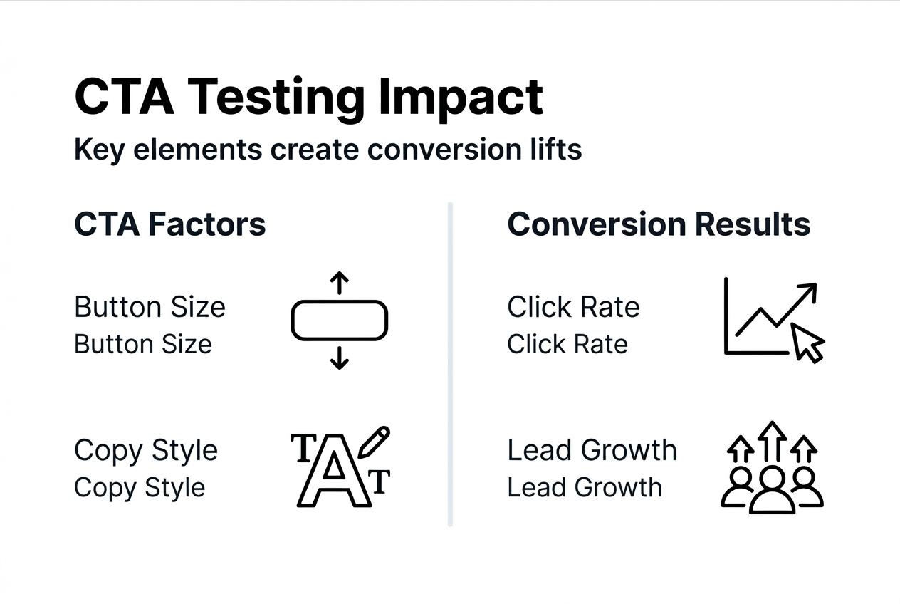
Key CTA elements to test and their impact on conversions
Focusing A/B tests on high-impact elements like subject lines and call-to-action buttons drives big improvements in clicks and revenue. Not all CTA components deserve equal testing attention. Prioritize elements with proven statistical impact on user behavior.

Action-oriented copy versus passive language. Button text creates immediate conversion differences. A/B testing CTAs with action-oriented copy lifts click through rate by 12-28%. Compare "Start Your Free Trial" against "Learn More" or test "Get My Discount" versus "View Pricing." Specific, benefit-focused language outperforms vague alternatives consistently.
Button size and visual prominence. Oversized buttons can look unprofessional while tiny CTAs get overlooked entirely. Test sizes that balance visibility with design aesthetics. Mobile users particularly benefit from larger tap targets, with optimal button heights around 44-48 pixels meeting accessibility standards.
Strategic placement drives engagement. CTAs above the fold increase likelihood of user engagement by 20-35% compared to below-the-fold placement. However, long-form content sometimes converts better with CTAs positioned after value propositions. Test both approaches for your specific audience and content type.
| CTA Element | Typical Conversion Impact | Best Use Case |
|---|---|---|
| Action copy | 12-28% lift | All CTAs benefit from specific, benefit-driven language |
| Button color | 5-15% lift | High contrast colors that match brand guidelines |
| Placement | 20-35% lift | Above fold for short pages, strategic for long content |
| Social proof | 10-18% lift | High-consideration purchases and B2B services |
| Button size | 8-12% lift | Mobile optimization and accessibility improvements |
Social proof integration near CTAs. Adding testimonials, trust badges, or user counts beside your CTA reduces purchase anxiety. Test different social proof formats: customer logos, review scores, or specific testimonials. B2B audiences particularly respond to recognizable company names while B2C shoppers prefer peer reviews.
Simplified navigation improves focus. Removing competing links and distractions around CTAs can improve conversion by up to 35%. Test versions with minimal navigation versus full menus. Landing pages specifically benefit from single-minded focus on one conversion action.
Pro Tip: Don't overlook micro-copy around your CTA. The supporting text immediately before or after your button influences decisions significantly. Test benefit statements, urgency indicators, or risk-reversal guarantees positioned near your call-to-action button optimization to maximize conversions.
Color psychology and contrast. While color alone rarely drives massive lifts, proper contrast ensures visibility. Test your brand colors against high-contrast alternatives. Orange and green buttons often outperform blue and gray, but your specific audience may differ. Let data, not design trends, guide your color choices.
Common pitfalls and how to avoid them when testing CTAs
Even experienced marketers make testing mistakes that invalidate results or waste resources. Understanding these pitfalls helps you design experiments that produce actionable insights and maximize ROI.
Invalid or unfocused hypotheses undermine tests. Invalid hypotheses are the biggest mistake in A/B testing resulting in unfocused tests and irrelevant data. Testing without a clear prediction based on research leads to random changes that don't address real user friction. Always tie your hypothesis to specific user behavior you've observed in analytics or feedback.
Testing low-traffic pages wastes limited resources. You need sufficient volume to reach statistical significance within a reasonable timeframe. A page with 200 monthly visitors requires months to validate results. Focus testing efforts on high-traffic pages where improvements scale immediately. Once you've optimized major pages, expand to lower-traffic areas.
Blindly copying competitor CTAs backfires. What works for their audience may fail for yours. Their blue button might convert better because their brand colors are blue, or their audience skews older with different color preferences. Test internally rather than assuming external case studies apply to your specific situation.
Critical testing mistakes to avoid:
- Stopping tests too early based on initial promising results
- Testing multiple elements simultaneously without proper multivariate setup
- Ignoring mobile versus desktop performance differences
- Failing to segment results by traffic source or user type
- Making changes during tests that invalidate data collection
- Not documenting test learnings for future reference
Pro Tip: Create a testing calendar that sequences experiments logically. Test broad concepts first like copy approach, then refine winning variations by testing specific word choices. This structured progression builds on validated learnings rather than starting from scratch each time.
Sample size and duration mistakes compromise validity. Running a test for just two days or with only 300 users per variation produces unreliable conclusions. You might declare a winner that was actually random variance. Calculate required sample sizes before launching and commit to the full test duration regardless of early trends.
"The temptation to call a test early when you see positive results is strong, but patience ensures your optimization decisions are based on genuine user preferences rather than statistical noise."
Common CTA optimization mistakes also include redesigning everything at once instead of iterating incrementally. When you change ten elements simultaneously, you can't identify which specific changes drove improvements. Even if conversions increase, you've learned nothing about why, making it impossible to replicate success elsewhere.
Ignoring qualitative feedback limits insights. Numbers show what happened but rarely explain why. Combine A/B testing with user surveys, session recordings, and customer interviews. This qualitative context helps you understand the psychology behind winning variations and apply those insights to future tests.
Boost your conversion rates with Gostellar's A/B testing tools
You've learned how to design effective CTA tests, which elements drive the biggest conversion lifts, and how to avoid common pitfalls that waste resources. Now it's time to put this knowledge into action with tools designed specifically for marketers at small to medium-sized businesses.
Gostellar's platform delivers the testing capabilities you need without the complexity of enterprise tools. Our lightweight 5.4KB script ensures your tests run without slowing down your site, while the no-code visual editor lets you create variations in minutes rather than waiting on developers. You can test CTA copy, colors, placement, and surrounding elements with a few clicks.
The platform includes advanced goal tracking so you measure exactly what matters for your business, whether that's form submissions, purchases, or custom conversion events. Real-time analytics show you how tests perform as data accumulates, and built-in statistical significance calculations tell you precisely when to implement winning variations. Start improving your CTAs today with Gostellar's tools built for efficient experimentation.
FAQ
How long should an A/B test for CTAs run to get reliable results?
Most tests need to run for 3-7 days to collect reliable data. This duration accounts for day-of-week variations in user behavior and ensures you capture sufficient traffic volume. Tests on high-traffic pages may reach significance faster, while lower-traffic pages require longer durations.
What are the most impactful CTA elements to test first?
Focus on action-oriented copy, button size and color, and placement above the fold. Testing subject lines and CTA buttons drives the biggest improvements in clicks and revenue. These elements consistently show measurable impact across industries and audience types.
How can small businesses with limited resources start testing CTAs effectively?
Many small businesses already have A/B testing tools built into their website platforms but don't know it. Start by testing simple changes one at a time with at least 1,000 users per variation. Focus on high-traffic pages first where improvements scale immediately, and leverage built-in platform features rather than investing in expensive standalone tools.
What sample size do I need for statistically significant CTA test results?
You need at least 1,000 visitors per variation to achieve statistical significance in most CTA tests. Lower traffic volumes produce unreliable results that may reflect random variance rather than genuine user preferences. Use sample size calculators to determine exact requirements based on your current conversion rate and the improvement you hope to detect.
Should I test CTAs differently for mobile versus desktop users?
Yes, mobile and desktop users interact with CTAs differently due to screen size, touch interfaces, and usage context. Test button sizes separately for mobile to ensure tap targets meet accessibility standards. Also evaluate whether mobile users respond better to CTAs placed earlier in the page flow since they're less likely to scroll extensively.
Recommended
Published: 3/11/2026