
Optimizely Logo Explained: Symbolism, Colors, and Best Practices
TL;DR:
- Proper use of the Optimizely logo requires adherence to legal and design guidelines because it is a registered trademark.
- The logo features an abstract geometric mark with a vibrant multicolor palette symbolizing experimentation and diversity.
- Accurate sourcing, color consistency, and respectful placement help maintain brand credibility and visual integrity.
Sourcing and using the Optimizely logo correctly is one of those tasks that sounds straightforward until it isn't. Marketers building A/B testing campaigns, pitch decks, or co-branded assets quickly discover there's no official style guide waiting for them on Optimizely's website. The result is guesswork, potential trademark violations, and off-brand visuals that quietly erode campaign credibility. Whether you're referencing the logo in a case study, integrating it into a testing workflow, or simply trying to get the hex codes right, this guide walks you through the logo's design, color meaning, symbolism, and compliant usage so you can move forward with confidence.
Table of Contents
- What defines the Optimizely logo?
- Color palette and its meaning
- Logo symbolism: Beyond just design
- Legal and practical guidelines for Optimizely logo usage
- A marketer's perspective: Why logo details matter more than you think
- Take your digital experimentation further
- Frequently asked questions
Key Takeaways
| Point | Details |
|---|---|
| Logo design essentials | The Optimizely logo represents systematic testing using modern, geometric design and typography. |
| Color symbolism | Each hue in the logo's palette conveys a strategic brand value such as trust or energy. |
| Trademarks matter | Commercial use of the Optimizely logo requires written permission due to trademark protection. |
| No public style guide | Official usage guidelines aren't published, so marketers should contact Optimizely or use vetted repositories. |
What defines the Optimizely logo?
At first glance, the Optimizely logo looks like clean, modern branding. Look closer and you'll find intentional design decisions packed into every element. The logo features an abstract geometric mark paired with a clean, modern sans-serif wordmark typography. That combination is deliberate: abstract geometry suggests process and structure, while sans-serif type feels approachable and digital-native.
The geometric mark isn't decorative noise. Abstract shapes in brand identity often signal that a company operates in complex, systematic territory, which fits perfectly for a platform built around data-driven experimentation. If you understand Optimizely's meaning as a brand rooted in controlled testing and iterative optimization, the logo suddenly makes a lot more sense.
Here's a quick breakdown of the core logo elements:
| Logo Element | Style | Design Summary |
|---|---|---|
| Geometric mark | Abstract, modular | Implies systematic process and variation |
| Wordmark | Sans-serif, modern | Clean, digital-first readability |
| Color application | Multicolor palette | Reflects experimentation and diversity |
| Overall feel | Minimal, structured | Data-forward, innovation-oriented |
A few things stand out worth noting:
- The geometric mark works both at large scale and small icon sizes
- The sans-serif wordmark is legible across screen resolutions without degrading
- The minimal structure keeps the logo versatile across light and dark backgrounds
- The whole system feels built for digital use first, print second
This isn't an accident. Brands in the experimentation and optimization space tend to favor clean geometry and neutral type because it communicates analytical rigor without feeling cold or inaccessible. Optimizely threads that needle well. For marketers, this design clarity is actually a gift: when you reference the logo in your materials, the visual language already carries authority and precision. You don't need to embellish it. Use it as-is, respect its proportions, and let the built-in symbolism do the heavy lifting.
One thing to keep in mind: the logo's minimal design means even small modifications, like stretching it, recoloring it, or applying drop shadows, immediately read as wrong. Visual coherence at this level of minimalism is fragile. Protect it.
Color palette and its meaning
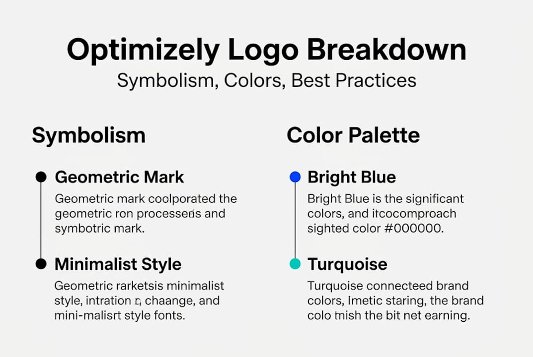
Color is where the Optimizely logo gets genuinely interesting. Most B2B SaaS brands default to a single-color or two-color system. Optimizely took a different route. The logo uses a vibrant multicolor palette: bright blue (#0037ff), turquoise (#00ccff), green (#3be081), purple (#861dff), and orange (#fc7f10). Five distinct hues in one identity system is a bold choice, and it carries specific meaning.

Here's how each color maps to brand intent:
| Color | Hex Code | Brand Association |
|---|---|---|
| Bright Blue | #0037ff | Trust, reliability, confidence |
| Turquoise | #00ccff | Clarity, innovation, openness |
| Green | #3be081 | Growth, progress, positive outcomes |
| Purple | #861dff | Sophistication, intelligence, depth |
| Orange | #fc7f10 | Energy, urgency, action |
The colors convey energy, growth, trust, and sophistication, which collectively spell out what Optimizely wants you to associate with its platform: a tool that is both trustworthy and dynamic. For a product built around testing variations, having a multicolor system is almost metaphorical. Each color is a variant. Together, they form a cohesive whole. That's experimentation made visual.
For marketers, this palette creates practical decisions. A few tips for consistent color usage:
- Use the official hex codes exactly. Never approximate from a screenshot.
- Don't mix Optimizely's palette with your own brand colors in ways that blur which brand owns which visual element.
- When using Optimizely colors in a co-branded context, give enough white space so both systems breathe.
- Avoid placing the multicolor mark on patterned or dark gradient backgrounds unless you have high contrast confirmed.
If you're applying these insights to your own experimentation tips and brand-aligned campaigns, understanding color psychology at this level gives you a real edge. Color decisions in your own landing page tests, for instance, can borrow from this logic: blue for trust in financial CTAs, orange for urgency in limited-time offers, green for confirmation states.
Pro Tip: Save Optimizely's official hex codes in your team's shared color library. Even if you only reference the logo occasionally, having the exact values on hand prevents rogue approximations that damage brand accuracy.
Logo symbolism: Beyond just design
The visual details of the Optimizely logo aren't just aesthetic. They communicate a philosophy. The abstract geometric mark implies systematic testing and scientific methodology, while the color spectrum conveys the full range of brand values simultaneously.
Think about what that means for a testing platform. Systematic testing isn't random. It's structured, repeatable, and hypothesis-driven. An abstract geometric form, as opposed to a literal icon like a beaker or graph, communicates that rigor without being obvious about it. That subtlety is intentional and effective.
"The best logos don't explain what a company does. They make you feel what a company stands for."
This is exactly what Optimizely's mark achieves. For marketers working with the brand in presentations, case studies, or no-code experimentation campaigns, that built-in symbolism works in your favor. When you place the Optimizely logo alongside your own campaign results, the logo itself silently signals credibility, process, and data-backed thinking.
Here's what each symbolic element delivers for your materials:
- Abstract geometric mark: Suggests structure and repeatable methodology
- Multicolor palette: Signals variation, diversity of approaches, and experimentation itself
- Blue and purple tones: Anchor the brand in trust and sophistication
- Green and orange: Inject energy and momentum, useful in growth-focused contexts
- Clean sans-serif type: Reinforces accessibility and modern digital thinking
Pro Tip: When creating case studies or campaign decks that feature Optimizely as a tool, position its logo near your results data. The logo's associations with systematic testing make your data feel more rigorous by proximity. That's not manipulation. That's smart visual strategy.
Legal and practical guidelines for Optimizely logo usage
Here's where most marketers run into trouble. The logo looks accessible. It's available online. It feels like fair game. But the Optimizely logo is a registered trademark and commercial use requires explicit written permission from Optimizely. That's a firm boundary that applies even when your intent is entirely legitimate.
The situation gets more complex because there is no public brand style guide available on Optimizely's official website. That means you can't just download an official PDF and follow the rules. For edge cases, like using the logo in a paid ad, a client report, or a co-branded campaign, you're in legally ambiguous territory without direct permission in writing.
For sourcing, official vector logos are available in SVG and PNG from reputable third-party repositories, though official guidelines from Optimizely themselves are not publicly documented. This means quality sourcing is possible, but legal clarity still requires direct outreach.
For Optimizely AB testing tips that involve referencing the platform visually, follow these steps:
- Identify your use case. Is it editorial (blog post, case study) or commercial (ad, paid content)? The bar is higher for commercial use.
- Source from a reputable repository. Use SVG or PNG formats to preserve quality. Avoid JPEG versions that compress and distort fine details.
- Contact Optimizely directly. Send a clear, specific request describing your use case. Commercial use without written approval creates real legal exposure.
- Document everything. Keep email confirmations and permissions in a shared team folder. If your usage is questioned later, documentation is your defense.
- Review before publishing. Run your asset by someone with an eye for brand compliance before it goes live.
Pro Tip: Set up a simple brand asset log in your team's project management tool. For every third-party logo you use, including Optimizely's, log the source, date sourced, permission status, and file format. It takes five minutes and saves hours of cleanup later.
A marketer's perspective: Why logo details matter more than you think
Most marketing teams treat third-party logos as low-stakes assets. You grab a PNG, drop it in the deck, and move on. That casual approach is exactly where credibility quietly leaks out of otherwise strong campaigns.
Getting logo details right, specifically the correct colors, proper proportions, and legally sourced files, signals something to your audience beyond the visual itself. It signals that your team is precise. And in a world where no-code experimentation campaigns live or die on trust, that precision matters enormously.
The uncomfortable truth is that most trademark violations aren't malicious. They're the result of moving too fast and assuming that good intent equals legal cover. It doesn't. An off-color Optimizely logo in a client-facing report or a compressed PNG in a paid ad won't just look bad. It can create legal friction that slows down campaigns you've already invested in.
Marketing teams that set high visual standards, even for borrowed assets, consistently outperform teams that don't. It's not about perfection for its own sake. It's about the compound effect of getting small things right across hundreds of touchpoints. Every pixel is a vote for how seriously you take your craft.
Take your digital experimentation further
Understanding how to use the Optimizely logo correctly is one piece of running polished, high-performing experiments. The bigger opportunity is building a testing workflow that matches that same level of precision across every asset and decision you make.
Stellar's digital experimentation platform gives marketers and growth hackers at SMBs the tools to run A/B tests without needing a developer. With a 5.4KB script that won't slow your site, a no-code visual editor, and real-time analytics, you can move from idea to insight faster than any enterprise tool on the market. There's even a free plan for businesses under 25,000 monthly tracked users. If you're serious about experimentation, this is where precision meets simplicity.
Frequently asked questions
Where can I find the official Optimizely logo files?
Official vector logos in SVG and PNG formats are available from third-party repositories, since Optimizely does not publish them directly on its own website.
Can I use the Optimizely logo in my marketing materials?
The Optimizely logo is a registered trademark and commercial use requires explicit written permission, so always verify trademark rules before including it in any paid or commercial context.
What do the colors in the Optimizely logo represent?
Each color carries a specific meaning: blue signals trust, orange brings energy, green reflects growth, and purple communicates sophistication, as outlined in the official color palette.
Is there an official Optimizely brand style guide?
No public brand style guide is available on Optimizely's website, so your best move is to contact Optimizely directly for official assets and usage guidance.
Recommended
- Unlocking the Optimizely Meaning: Your Comprehensive Guide to Digital Experimentation
- Optimizely guide: smarter experimentation for SMBs
- Optimizely A/B testing: No-code experimentation for marketers
- How Much Does Optimizely Cost? A Look at Their 2025 Pricing
- Types of visual branding to boost market recognition | Radka Advertising
Published: 4/21/2026