
Understanding Responsive Design Essentials for Growth
Website visitors are quick to judge a site based on how it looks and feels on their device. Now think about this. A poorly designed mobile website can cause conversion rates to drop by up to 60%. Most people expect a flawless experience no matter what screen they are using, but many businesses still treat mobile and desktop users differently. The real advantage comes from designing a site that automatically adapts to any device, unlocking better engagement and bigger results.
Table of Contents
- What Is Responsive Design And Its Core Principles?
- How Responsive Design Works Across Devices And Platforms
- Key Concepts In Responsive Design: Media Queries And Flexbox
- Real-World Applications And Benefits Of Responsive Design
Quick Summary
| Takeaway | Explanation |
|---|---|
| Responsive design adapts to all devices | It ensures websites function well on smartphones, tablets, and desktops, enhancing user experiences. |
| Fluid grids and flexible media are essential | Utilizing relative sizing and scalable images allows for seamless adjustments to different screen sizes. |
| Responsive design improves SEO performance | Mobile-friendly sites rank better, leading to higher visibility and organic traffic. |
| Consistent user experiences reduce bounce rates | A unified design strategy keeps users engaged and encourages them to explore further. |
| Responsive design simplifies development processes | One website adapts across devices, lowering costs and maintenance efforts compared to separate sites. |
What is Responsive Design and Its Core Principles?
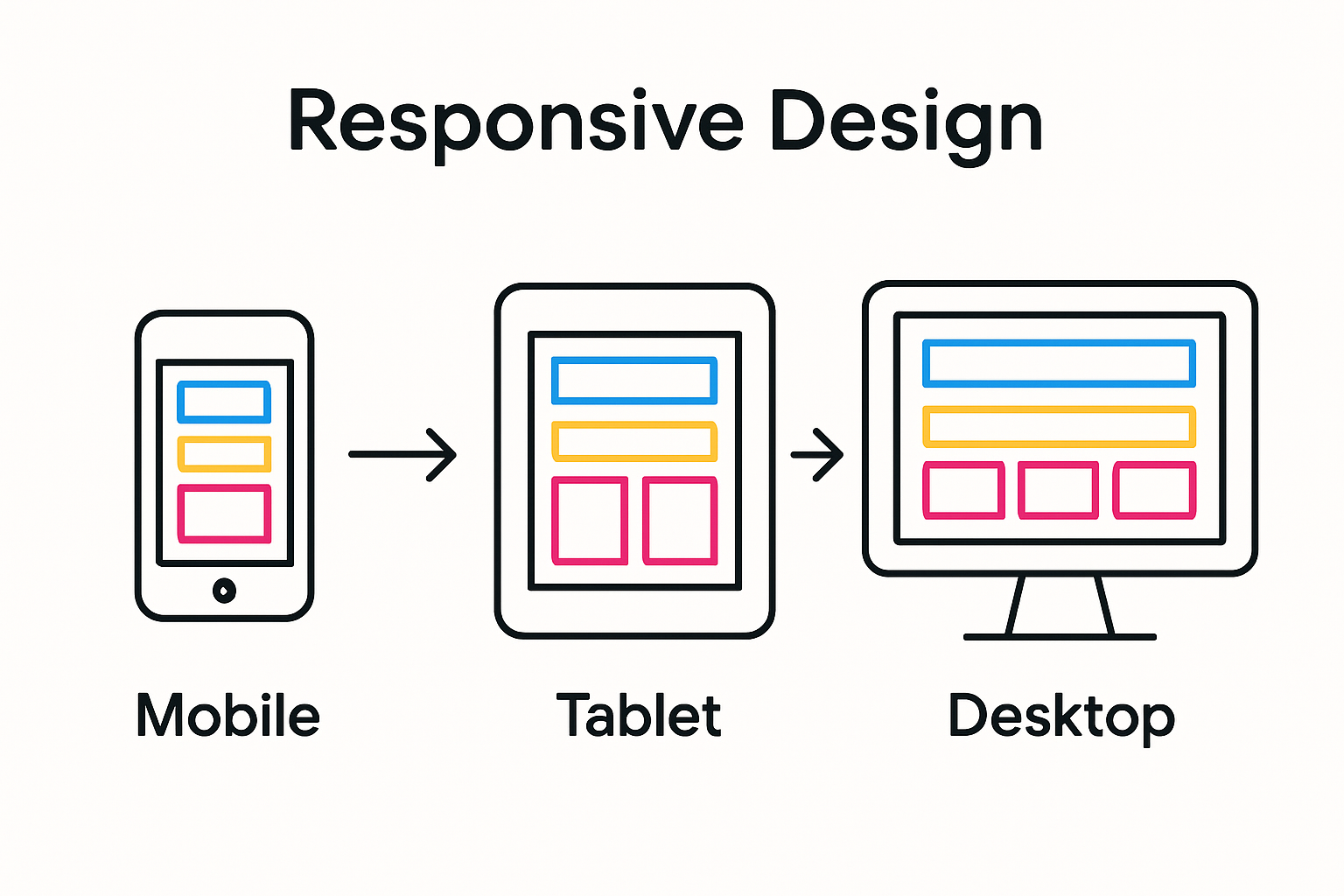
Responsive design represents a critical approach to web development that ensures websites adapt seamlessly across various devices and screen sizes. At its core, responsive design transforms how users interact with digital content by creating flexible, dynamic web experiences that look and function perfectly whether accessed on a smartphone, tablet, laptop, or desktop computer.
Understanding the Fundamental Concept
Responsive design is not merely about making websites look good on different screens. Learn more about adaptive web strategies that can dramatically improve user engagement. According to web.dev, the methodology involves three primary technical components:
- Fluid Grid Systems: Layouts that use relative sizing instead of fixed pixel measurements
- Flexible Media: Images and multimedia elements that scale proportionally
- CSS Media Queries: Technical rules that adjust design based on device characteristics
Why Responsive Design Matters for Digital Growth
In today's multi device world, responsive design is no longer optional but essential. Websites that fail to adapt risk losing significant traffic and conversion opportunities. Research demonstrates that users quickly abandon sites that do not render correctly on their specific device.
The primary objectives of responsive design include:
- Creating consistent user experiences across platforms
- Improving website accessibility
- Enhancing search engine optimization performance
- Reducing development and maintenance complexity
By implementing responsive design principles, businesses can create digital experiences that are both visually appealing and functionally robust, ultimately driving better user engagement and supporting long term digital growth strategies.
The table below summarizes the core technical components of responsive design, explaining each element and how it improves user experience across devices.
| Component | Explanation | Impact on User Experience |
|---|---|---|
| Fluid Grid Systems | Use relative sizing (percentages) for layout instead of fixed pixels | Creates flexible layouts for all screens |
| Flexible Media | Images and media scale proportionally within their containers | Prevents image distortion and overflow |
| CSS Media Queries | Apply different styles based on device features like width and orientation | Adapts content for optimal readability |
| Breakpoint Strategies | Define widths where layouts shift for best display on each device | Ensures smooth transitions between devices |
| Flexbox Layout | Enables dynamic content positioning and flexible alignment | Maintains visual consistency and usability |
Why Responsive Design Matters for Digital Marketing
Responsive design has evolved from a trendy web development technique to a critical strategic imperative for digital marketing success. By ensuring seamless user experiences across multiple devices, responsive design directly impacts marketing performance and customer engagement.
Impact on User Experience and Conversion Rates
Discover advanced digital marketing strategies that leverage responsive design principles. According to Nielsen Norman Group, mobile users are significantly more likely to abandon websites that do not render correctly, with conversion rates dropping by up to 60% on poorly designed mobile interfaces.
Key user experience considerations include:
- Reducing bounce rates by providing consistent navigation
- Eliminating horizontal scrolling and zoom requirements
- Ensuring readable text and appropriately sized touch targets
SEO and Digital Marketing Performance
Search engines like Google prioritize mobile friendly websites in their ranking algorithms. Responsive design directly influences several critical SEO metrics:
- Improved page load speeds across devices
- Lower bounce rates signaling quality content
- Single URL structure reducing duplicate content issues
- Enhanced user engagement signals
By implementing responsive design, digital marketers can simultaneously improve search engine visibility and user experience, creating a powerful synergy that drives organic traffic and potential conversions. The unified approach eliminates the need for separate mobile and desktop websites, streamlining development and maintenance efforts while providing a cohesive brand experience across all digital touchpoints.
How Responsive Design Works Across Devices and Platforms
Responsive design operates through sophisticated technical mechanisms that dynamically adjust web content to match different screen sizes, resolutions, and device capabilities. This adaptive approach ensures seamless user experiences across smartphones, tablets, laptops, and desktop computers.
Technical Foundations of Device Adaptation
Explore advanced device testing strategies that complement responsive design principles. According to EDUCAUSE Review, responsive design relies on three fundamental technical components:
- CSS Media Queries: Detect device characteristics like screen width, height, and orientation
- Fluid Grid Systems: Use relative units (percentages) instead of fixed pixel measurements
- Flexible Media Elements: Scale images and multimedia proportionally within container layouts
Responsive Design Breakpoint Strategies
Breakpoints represent critical transition points where website layouts fundamentally reshape themselves to accommodate different screen sizes. Typical breakpoint ranges include:
- Mobile devices (up to 576 pixels wide)
- Tablets (577 to 992 pixels)
- Desktop screens (993 pixels and above)
By implementing intelligent breakpoint strategies, developers can create websites that look and function optimally across diverse digital platforms.
 The goal is not merely visual adaptation but maintaining intuitive navigation, readability, and interactive functionality regardless of device specifications.
Responsive design transforms web experiences by treating content as a flexible, dynamic entity that gracefully adjusts to user context, ensuring consistent performance and engagement across an increasingly complex digital ecosystem.
Key Concepts in Responsive Design: Media Queries and Flexbox
Responsive web design relies on sophisticated technical strategies that enable websites to adapt dynamically across different devices and screen sizes. Two fundamental technologies stand at the forefront of this adaptive approach: CSS media queries and Flexbox layout systems.
Understanding CSS Media Queries
Explore advanced responsive design techniques that optimize digital experiences. According to research from the IEEE, media queries represent a critical mechanism for creating context aware web interfaces. These CSS rules allow developers to apply specific styles based on device characteristics such as:
- Screen width and height
- Device orientation
- Screen resolution
- Color capabilities
- Aspect ratio
Flexbox: Dynamic Layout Management
Flexbox provides a powerful, flexible layout model that enables precise content positioning and distribution across different screen sizes. Unlike traditional layout methods, Flexbox introduces:
- Automatic content reflow
- Efficient space distribution
- Alignment control without fixed dimensions
- Simplified responsive design implementation
By combining media queries with Flexbox, developers can create web interfaces that respond intelligently to user device specifications.
This approach ensures consistent visual experiences while maintaining optimal readability and functionality across smartphones, tablets, laptops, and desktop computers.
Real-World Applications and Benefits of Responsive Design
Responsive design transcends theoretical concepts, delivering tangible benefits across diverse digital landscapes. By creating adaptable web experiences, organizations can significantly enhance user engagement, brand perception, and conversion potential.
Business Performance and User Experience
Learn about website accessibility and conversions that directly impact digital success. According to EDUCAUSE Review, responsive design offers profound strategic advantages:
- Unified user experience across multiple devices
- Reduced development and maintenance costs
- Improved search engine optimization performance
- Enhanced brand consistency
Industry-Specific Responsive Design Applications
Responsive design strategies demonstrate remarkable versatility across multiple sectors. Key application domains include:
- E-commerce platforms optimizing product browsing experiences
- Educational websites ensuring content accessibility
- Healthcare portals providing seamless patient information access
- Financial service interfaces supporting secure mobile transactions
The fundamental principle remains consistent: delivering optimal user experiences regardless of device specifications. By prioritizing flexible, intelligent design, organizations can create digital interfaces that adapt intuitively to user needs, ultimately driving engagement and supporting strategic growth objectives.
This table compares the unique advantages responsive design provides to different business sectors as discussed in the article.
| Industry Sector | Responsive Design Application | Benefit |
|---|---|---|
| E-commerce | Product browsing adaptation | Streamlined shopping on any device |
| Education | Course and resource accessibility | Consistent learning experience for all users |
| Healthcare | Patient information access | Easy, secure browsing for medical info on any device |
| Financial Services | Secure mobile transactions | Reliable online banking and account management |

Unlock Your Growth with Responsive Design and Effortless A/B Testing
Are you struggling to deliver seamless user experiences while keeping your website fast and conversion-focused? The article revealed how responsive design is crucial for digital growth, but actually optimizing your site for every device and user can feel overwhelming. Marketers and growth hackers want to reduce bounce rates, streamline user journeys, and boost conversions—yet juggling technical tools often slows you down.
What if you could combine world-class responsive design with instant A/B testing and keep your site lightning-fast?
Experience how Stellar makes it simple to run rapid A/B tests on your responsive site. Our SaaS platform features a no-code visual editor and a script so lightweight it will not affect your page speed or user experience. Set up your first experiment in minutes and unlock actionable insights with advanced goal tracking and real-time analytics. Take advantage of a free plan to start enhancing your website today and see immediate improvements in both user experience and conversion rates. Take the next step for your business and try Stellar now while growth opportunities are at their peak.
Frequently Asked Questions
What is responsive design?
Responsive design is a web development approach that allows websites to adapt seamlessly to various devices and screen sizes, ensuring optimal user experience and functionality across smartphones, tablets, laptops, and desktops.
Why is responsive design important for digital growth?
Responsive design is essential because it improves user engagement, enhances website accessibility, boosts search engine optimization (SEO) performance, and reduces development and maintenance complexity, vital for digital marketing success.
How do media queries work in responsive design?
Media queries are CSS rules that enable developers to apply specific styles based on device characteristics such as screen width, height, and orientation, allowing the layout to adjust dynamically for different devices.
What are the key benefits of using Flexbox in responsive design?
Flexbox simplifies layout management by allowing automatic content reflow, efficient space distribution, and alignment control without fixed dimensions, making it easier to create responsive web interfaces that maintain visual consistency across various devices.
Recommended
Published: 9/8/2025