
User Testing Websites: A 2026 Guide for Teams
TL;DR:
- User testing websites involves observing real users completing specific tasks to uncover usability issues and improve conversion rates. Selecting appropriate tools, designing clear tasks, and testing with authentic participants are essential for reliable insights and actionable improvements. Iterative testing on critical flows, combined with proper analysis and retesting, drives continuous website optimization and increased revenue.
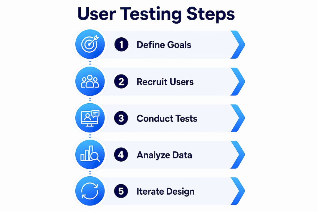
User testing websites is the practice of observing real users complete defined tasks on your site to expose usability problems and conversion barriers. Platforms like UserTesting, Maze, and Hotjar have made this practice accessible to product teams of every size. The payoff is direct: teams that test before shipping catch friction at checkout, sign-up, and pricing pages before those problems cost revenue. This guide covers tool selection, session design, sample sizing, common mistakes, and how to turn raw observations into site improvements that actually move conversion numbers.
What tools do you need for user testing websites?
The right tool depends on what you are testing and what data you need. User testing tools fall into three broad categories: live website testing, prototype testing, and behavior analytics.

Maze, Lyssna, and Hotjar each serve a different purpose. Maze excels at Figma prototype tests and generates heatmaps alongside task success rates. Lyssna handles static design comparisons and preference tests well. Hotjar analyzes live website behavior through session recordings and click maps. Choosing the wrong tool for your goal wastes both time and budget.

| Tool | Best For | Key Feature | Starting Price |
|---|---|---|---|
| UserTesting | Moderated and unmoderated live tests | Video recordings with participant panel | From $15,000/year |
| Maze | Prototype and live site task testing | Heatmaps, success paths, Figma integration | Free tier available |
| Lyssna | Preference and first-click tests | Fast recruitment, static design testing | Free tier available |
| Hotjar | Live site behavior analysis | Session recordings, heatmaps, surveys | Free tier available |
Participant recruitment is where most teams cut corners. Testing with colleagues or friends produces misleading data because they already understand your product. Recruit from your actual user base or use a panel service like UserTesting or Respondent to reach screened participants who match your customer profile. The quality of your participants determines the quality of your findings.
Before you open any tool, define your testing goals. Are you trying to understand why sign-ups drop off? Are you checking whether users can find the pricing page? A clear goal shapes every decision that follows, from task wording to the number of sessions you run.
How do you design and run effective testing sessions?
Session design is where most usability studies succeed or fail. The structure below applies whether you are running moderated sessions over Zoom or sending unmoderated tasks through Maze.
- Write task instructions in plain language. Tell users what to accomplish, not how to do it. "Find a plan that fits a team of five and begin the checkout process" is correct. "Click the pricing button and select the Team plan" is not. Leading instructions destroy the authenticity of the data.
- Choose your testing format. Moderated testing suits situations where you need to understand why users make certain choices. Unmoderated testing works when you need faster results or broader participant reach. Neither format is universally better. Match the format to your research question.
- Run a pilot test with 1–2 participants. GitLab recommends pilot runs before scaling any unmoderated study. A pilot surfaces confusing instructions before they corrupt your full dataset. This single step saves hours of analysis on bad data.
- Keep sessions to 15–20 minutes. Unmoderated remote tests that run longer see drop-off and lower-quality responses. Fifteen minutes is enough to cover two or three focused tasks without fatiguing participants.
- Record everything. Video recordings capture hesitations, facial expressions, and verbal comments that task completion rates alone miss. Pair recordings with heatmaps from tools like Hotjar or Maze's live website testing to see both the behavior and the path.
Pro Tip: Write your tasks, then read them aloud to someone outside your team. If they ask a clarifying question, rewrite the task. Ambiguity that feels obvious to you is invisible until a real participant hits it.
How many users should you test for reliable results?
The five-user rule is the most repeated and most misunderstood guideline in web usability testing. Testing with five users typically uncovers about 85% of usability issues for a single, well-defined task. That figure applies only to qualitative discovery on a homogeneous user group. It is not a universal law.
The right sample size depends on your goal and your product's complexity.
| Test Goal | Recommended Users | Rationale |
|---|---|---|
| Qualitative discovery | 5–8 per segment | Uncovers most issues; fast and affordable |
| Multiple user segments | 5–8 per segment | Different groups surface different problems |
| Quantitative validation | 20–40+ | Statistical significance requires larger samples |
| High-risk systems (e.g., healthcare) | 15+ per group | Complex or high-stakes products need deeper coverage |
Iterative testing outperforms a single large study every time. Run five users, fix the top issues, then test five fresh users on the updated version. Small iterative rounds produce higher quality insights than one 40-person study because each round builds on the last. You are not just finding problems. You are verifying that your fixes actually worked.
Pro Tip: Never reuse participants across rounds. Fresh users have not been primed by the previous version of your site. Their reactions are uncontaminated, which makes the comparison between rounds valid.
What are the most common mistakes in website usability testing?
Even experienced teams repeat the same errors. Knowing these pitfalls in advance protects your data quality and your timeline.
The five most common mistakes:
- Testing with the wrong participants. Convenience samples (coworkers, friends) produce optimistic results because they are already familiar with your product's logic.
- Writing leading task instructions. Phrases like "use the search bar to find..." tell users what to do instead of letting you observe what they actually do.
- Testing too broadly. Asking users to "explore the site" generates vague data. Focused tasks on specific flows produce findings you can act on.
- Ignoring behavioral signals. Long pauses, backtracking, and workarounds are strong usability problem signals. Teams that only track task completion miss these entirely.
- Running one large study instead of iterating. A single 30-person study tells you what is broken. It does not tell you whether your fix worked.
Five best practices that separate good studies from great ones:
- Recruit participants who match your actual customer profile, not your internal team.
- Use realistic scenarios. "You just received an email about a new pricing plan. Find out what it costs for your team" beats "go to the pricing page."
- Observe actual task behavior rather than asking users what they think they would do. Opinions and behavior diverge constantly.
- Debrief after each session. Note the three most significant observations while they are fresh.
- Prioritize fixes by frequency and impact, not by how easy they are to implement.
Pro Tip: If multiple participants produce inconsistent results on the same task, the problem is almost always the task wording, not the participants. Rewrite before you retest.
How do you analyze results and improve your website?
Raw session recordings are not insights. Analysis turns observations into a prioritized list of fixes. Follow this sequence to move from data to decisions.
- Code your recordings. Watch each session and tag moments where users hesitate, fail, or take unexpected paths. Tools like UserTesting's dashboard let you clip and annotate these moments directly.
- Identify patterns across sessions. A single user struggling with your navigation is an outlier. Three users struggling in the same spot is a finding. Look for frequency before drawing conclusions.
- Prioritize by impact and location. Decision points and friction areas like checkout, sign-up, and pricing pages deserve attention first. A usability issue on your homepage costs more revenue than one buried in account settings.
- Build a fix list with owners. Each issue gets a description, a severity rating, and a team member responsible for the fix. Vague findings ("navigation is confusing") never get resolved. Specific ones do ("three of five users could not find the pricing page from the homepage").
- Retest after fixing. Deploy the change, then run a fresh round of testing with new participants. This confirms the fix worked and often surfaces secondary issues the original problem was masking.
Hotjar heatmaps and Maze path analysis are useful at this stage. They show aggregate behavior across many sessions, which helps you confirm whether the patterns you saw in qualitative testing hold at scale. Pair qualitative observations with quantitative behavior data for the clearest picture. You can also layer in A/B testing strategies to validate specific changes against live traffic before committing to a full rollout.
Key takeaways
Iterative user testing with focused tasks and the right participants produces more reliable insights than any single large study.
| Point | Details |
|---|---|
| Match tools to your goal | Maze suits prototype testing; Hotjar and Maze's live feature suit production site analysis. |
| Pilot every study first | Run 1–2 participants before scaling to catch flawed task wording early. |
| Size samples by test type | Five users work for qualitative discovery; 20–40+ are needed for quantitative validation. |
| Focus on decision points | Test checkout, sign-up, and pricing flows before broad browsing paths. |
| Iterate, don't just test once | Fix issues between rounds and retest with fresh participants to confirm improvements. |
Why i think most teams are testing the wrong things
Most product teams I have worked with treat user testing as a box to check before launch. They run one study, generate a report, fix the obvious issues, and move on. That approach misses the real value of the practice.
The teams that get the most from web usability testing are obsessive about where they test, not just how they test. They ignore broad browsing sessions entirely and go straight to the moments that cost them money: the pricing page, the sign-up flow, the first 90 seconds after a user lands from a paid ad. Those are the spots where confusion translates directly into lost revenue.
The other thing I have seen consistently: teams underestimate how much bad task wording corrupts their data. They spend weeks analyzing results that were poisoned by a single ambiguous instruction. A 20-minute pilot run with two participants would have caught it. The five-user rule debate is interesting, but the more practical question is whether your tasks are clean enough to produce trustworthy data at any sample size.
My honest recommendation: run smaller, more frequent studies. Test one flow per round. Fix what you find. Retest with fresh participants. That cycle, repeated consistently, compounds into a meaningfully better product over six months. One big annual study does not.
— Juan
Start testing smarter with Gostellar
If user testing reveals where friction lives, A/B testing confirms which fix actually works. Gostellar is built for exactly that next step.
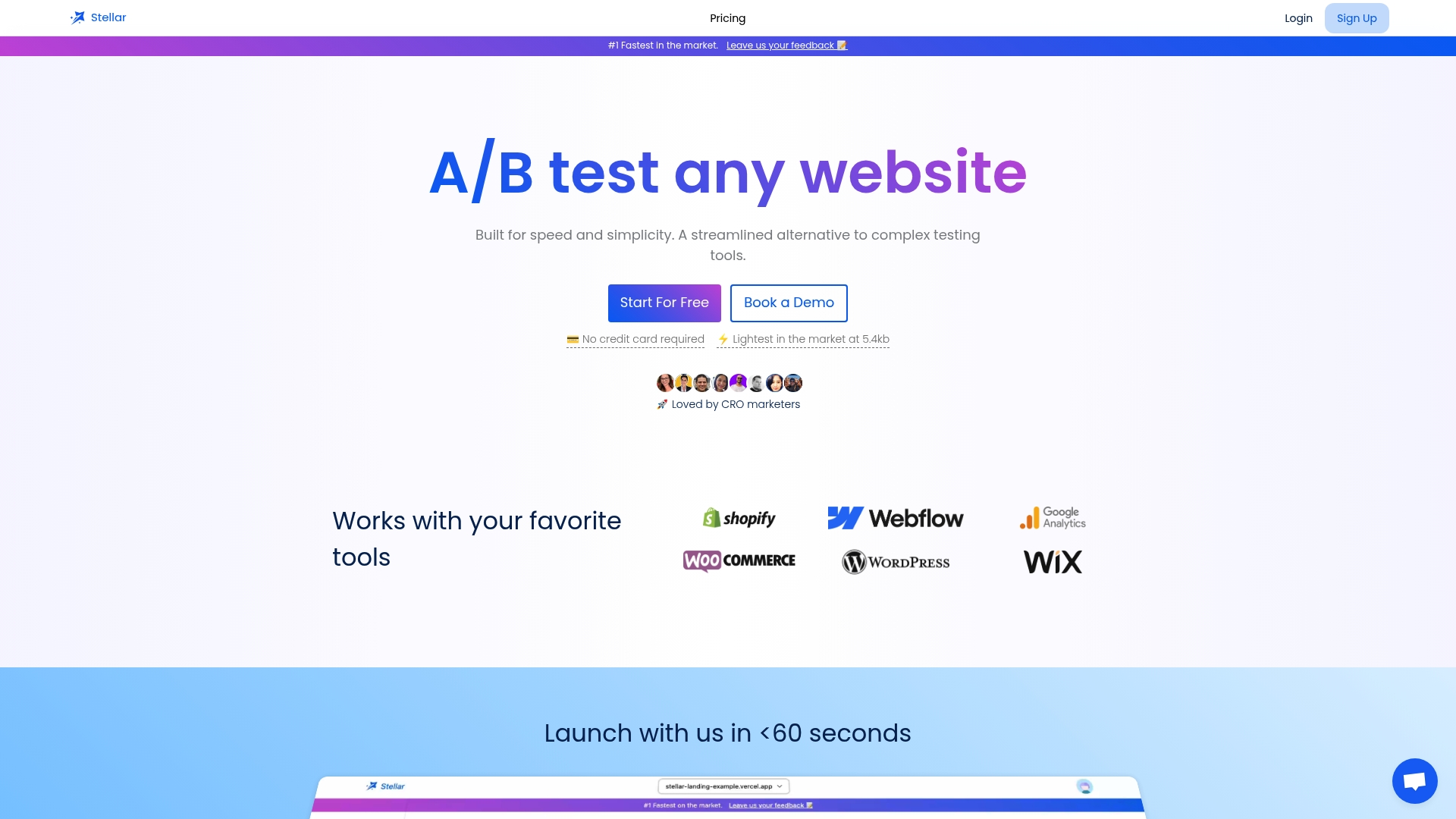
Gostellar's no-code visual editor lets your team deploy changes and run experiments directly on your live site without waiting on developers. Its 5.4KB script keeps page performance intact while real-time analytics show you which variant wins. Whether you are testing a revised pricing layout or a new sign-up flow, Gostellar connects your usability findings to measurable conversion outcomes. Teams under 25,000 monthly tracked users can start for free and see results before committing to a paid plan. Pair it with the insights from your website usability testing process and you have a complete optimization loop.
FAQ
What is user testing for websites?
User testing for websites is the process of observing real users complete specific tasks on a site to identify usability problems. The goal is to collect behavioral evidence, not opinions, so teams can make informed design and conversion decisions.
How many users do i need for a usability test?
Five users are enough to uncover most issues in a qualitative study focused on a single task. Quantitative validation of conversion rate changes requires 20–40+ participants to reach statistical significance.
What is the difference between moderated and unmoderated testing?
Moderated testing involves a facilitator guiding the session in real time, which is useful for understanding the reasoning behind user choices. Unmoderated testing runs without a facilitator, making it faster and better suited for reaching larger or geographically distributed participant groups.
Which tools are best for live website usability testing?
Maze's live website testing feature, Hotjar, and UserTesting are the most widely used platforms for testing production sites. Each captures session recordings and behavioral data, though they differ in recruitment options, pricing, and depth of analytics.
How do i avoid bad data in unmoderated tests?
Run a pilot study with 1–2 participants before scaling any unmoderated test. Pilot runs surface ambiguous task wording before it corrupts your full dataset, which is the leading cause of unreliable results in remote usability studies.
Recommended
Published: 6/14/2026